A Different Take on Designing Fall Merch
Fall comes with a better mood board than most seasons: arena lights, cider stands, chilly nights, haunted trails and leftovers worth fighting over. A design that stops at orange type and a pumpkin is leaving a lot on the table.
The best fall merch doesn't downplay the season. It gets more specific about which version of fall it belongs to.
Maybe it's an after-dark hockey league, a local harvest festival or a food-and-friends club built around the best meal of the year. Give the design a place, a crowd and a point of view, and it becomes more than proof that someone knows what month it is.
Let fall set the scene. Just give people a better reason to wear it.
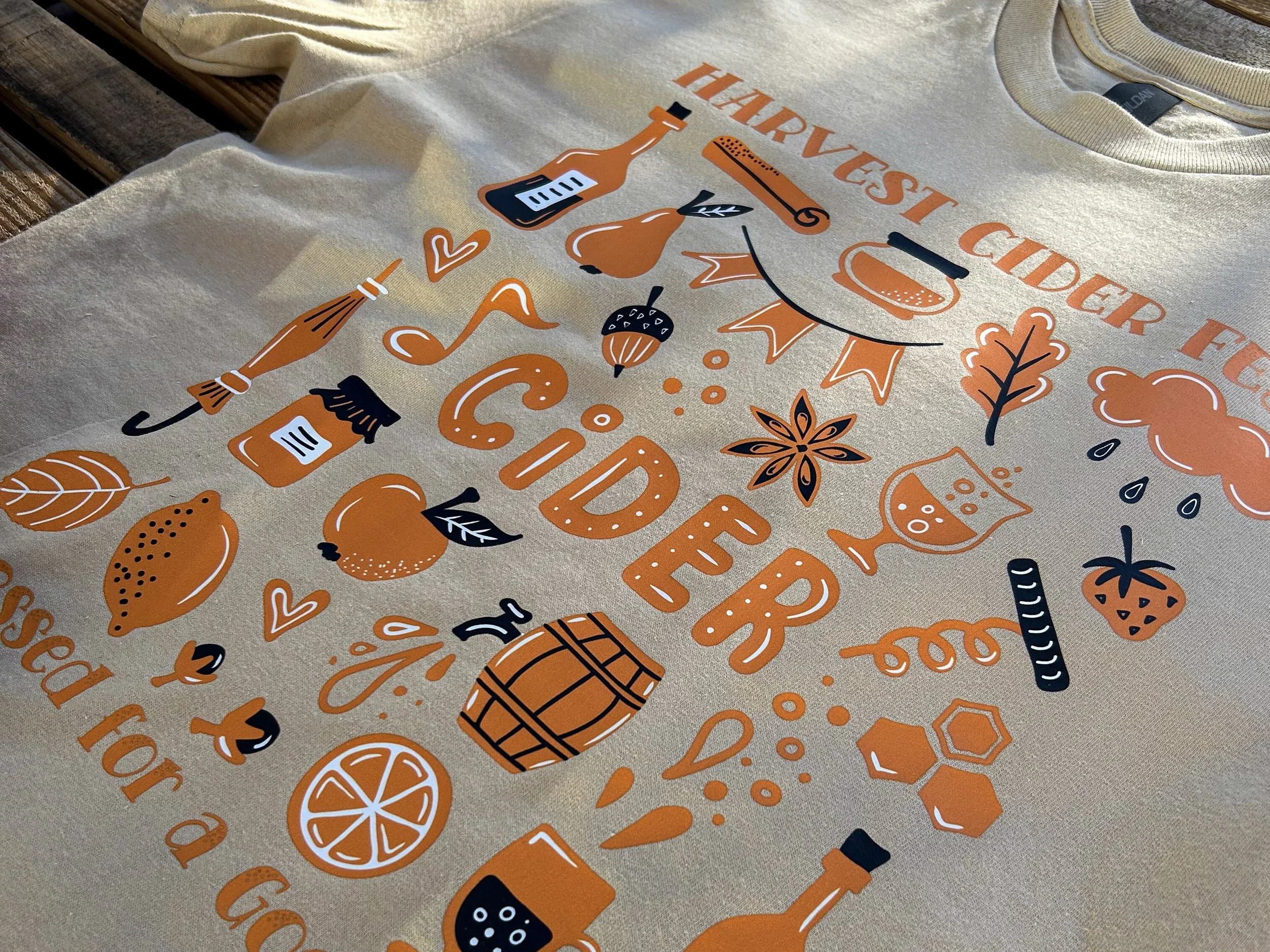
Full-color colorVIBE DTF keeps the Harvest Cider Fest illustration crisp and colorful on a Gildan Ultra Cotton 100% US Cotton T-Shirt in Tan.
What makes seasonal merchandise wearable beyond the holiday?
Seasonal merchandise becomes more wearable when the design offers more than a calendar reference. Give it a clear identity, a recognizable audience and a focused mood people can connect with after the occasion passes.
The goal isn't to scrub every pumpkin from the artwork. It's to make sure the pumpkin isn't doing every job.
| Short-lived approach | Longer-wear approach | Why it matters |
|---|---|---|
| The holiday does all the talking | An identity or experience leads the concept | The wearer gets more than a date to identify with. |
| Every seasonal icon gets invited | One or two signals establish the mood | Selective cues feel intentional instead of crowded. |
| The year gets top billing | Dates are secondary or easy to update | The piece doesn't immediately look outdated. |
| The print method is an afterthought | The print experience supports the concept | Color, hand and finish reinforce the intended mood. |
Pumpkins are not a target audience
A pumpkin, ghost, apple or turkey can tell you the season. It can't tell you who should care about the shirt.
Define the wearer before you build the graphic. A late-night hockey league, a local festival crowd and a restaurant audience each give you better material than a hayride full of interchangeable fall icons.
Start the brief with one sentence: This is merchandise for people who ______. Fill the blank with a behavior, place or shared experience. If the only answer is 'celebrate the holiday,' the concept needs another layer.
Build a world not just a graphic
A good name doesn't just fill the biggest line of type. It gives the design a world to live in. A club, team, event, trail, festival, society or brand gives the artwork an identity and the wearer a reason to care.
Night Flyers reads like merch for an adult recreational hockey league, with Halloween in the details. Harvest Cider Fest gives its fall artwork a specific event identity. The Leftovers Club turns a familiar Thanksgiving ritual into cozy, illustrated merch.
That's what makes seasonal merch worth picking up: it can show support for a team, mark an event or simply look too good to leave behind.
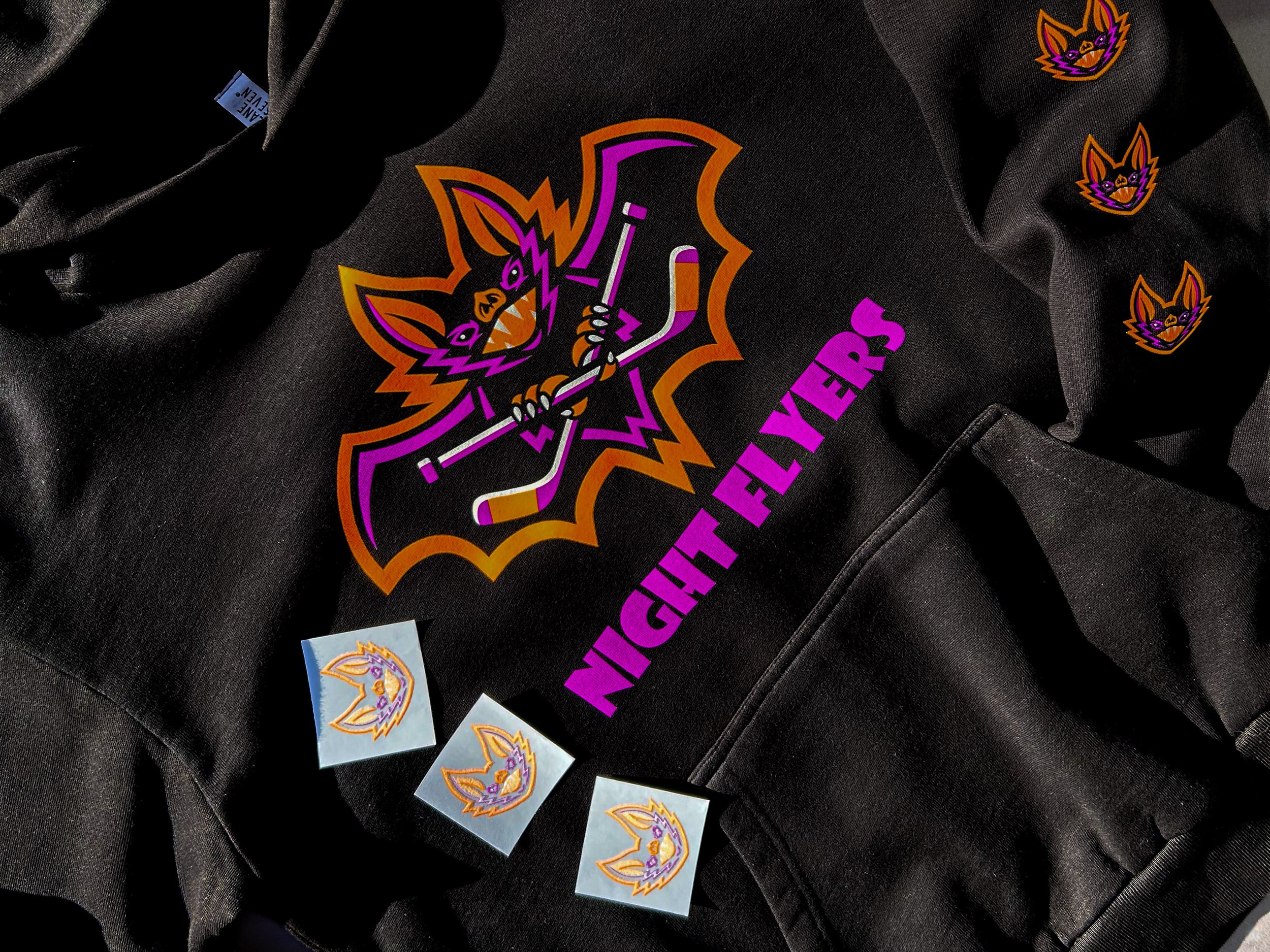
Howard Multi-Purpose in Neon Orange, Neon Purple and White gives the Night Flyers artwork bold color and fine detail across this black Lane Seven Urban Hoodie.
You have more than orange to work with
Fall has more design tools than a symbol library. Color, texture, lettering, garment weight, print placement and finish can all signal the season before another leaf enters the layout.
A neon palette against black can create an after-dark energy without covering the design in Halloween symbols. Warm brown and tan can place event merchandise in a harvest setting before the viewer reads a word. Copper Shimmer against ash grey can add warmth and a metallic-like sheen to illustrated fall artwork without turning it into a costume piece.
That gives the designer more control. Instead of asking how many fall elements can fit, ask which one decision makes someone feel the season first.
One anchor. Two signals. No icon pileup.
Use three levels to keep the concept focused and the hierarchy clear.
| Level | Job | Example |
|---|---|---|
| Identity anchor | Tells the viewer what the piece belongs to | Night Flyers, Harvest Cider Fest or The Leftovers Club |
| Seasonal signal | Creates the time-of-year mood | Neon after-dark color, harvest tones or food-and-gathering illustration |
| Merch signal | Makes the design feel like a real product | A strong back graphic, small front mark, sleeve detail or festival graphic |
A strong anchor lets the supporting signals use their indoor voices. That's often what makes the finished piece feel like real merchandise instead of the entire fall aisle printed at once.
Try the six-weeks-later test
Picture the piece in a closet six weeks after the holiday. The candy is gone. The porch pumpkin has seen better days. Would someone still want to wear it?
For a fall retail piece, the color, artwork, humor or finish can keep it in rotation. Event merch has a different job. It can bring someone back to a day they enjoyed. In either case, give people something to like about the garment itself, whether that's the design, the feel or the memory attached to it.
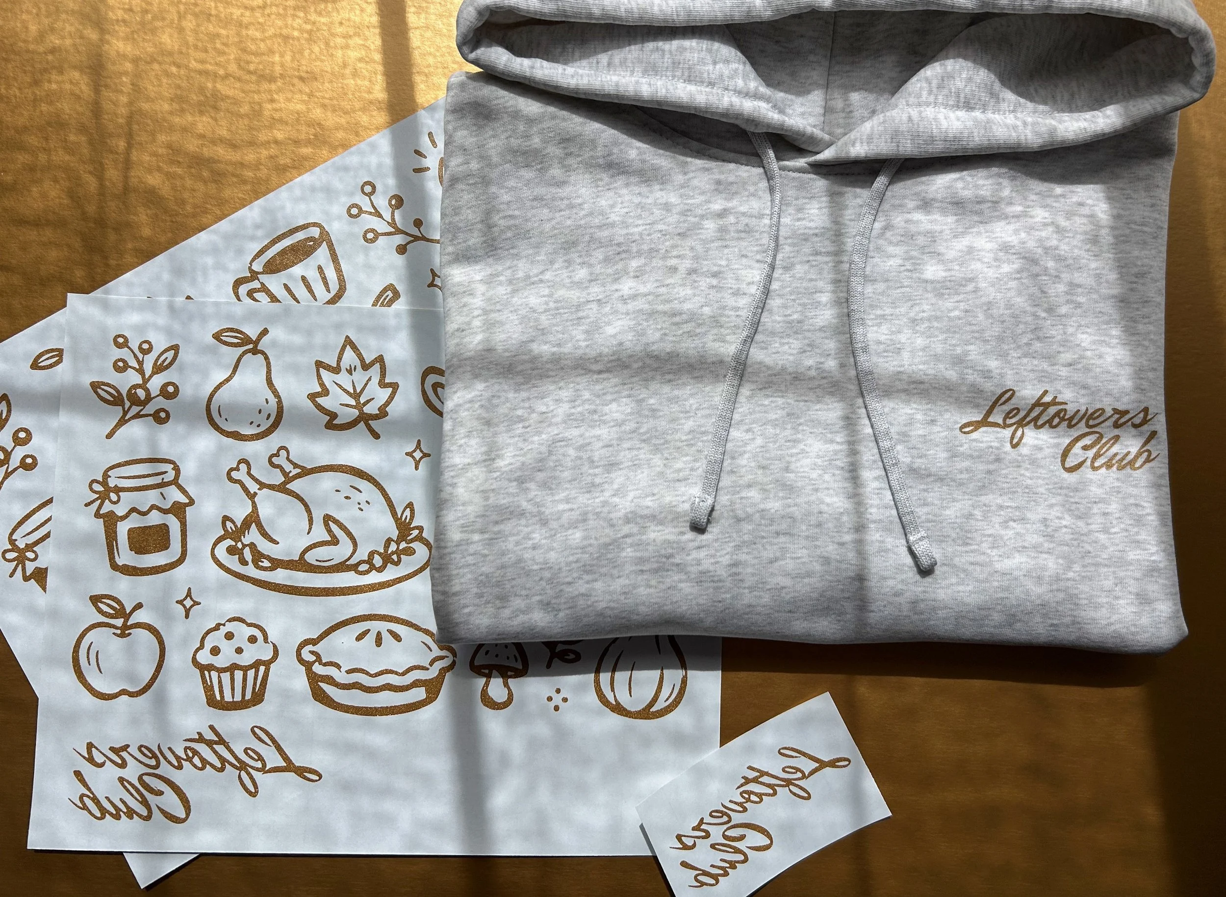
Howard Hot Peel in Copper Shimmer adds a soft hand and warm metallic-like sheen to The Leftovers Club on a Cool Heather Grey Stanley/Stella Women’s Stella Nora Hooded Sweatshirt.
Make the transfer part of the idea
Transfer selection isn't the technical chore waiting at the end of the fun part. The print changes how the merchandise looks, feels and wears, so it belongs in the creative decision.
Night Flyers uses Howard Multi-Purpose in Neon Orange, Neon Purple and White to give an adult recreational hockey league bold after-dark energy against black. Harvest Cider Fest uses colorVIBE DTF to carry the same detailed, full-color event identity across a tan tee and brown tote. The Leftovers Club pairs Howard Hot Peel in Copper Shimmer with a Stanley/Stella hoodie for a soft hand, warm metallic-like sheen and cozy, retail-quality feel.
The point isn't that every fall project needs a specialty transfer. It's that the print should strengthen the idea instead of merely reproducing it.
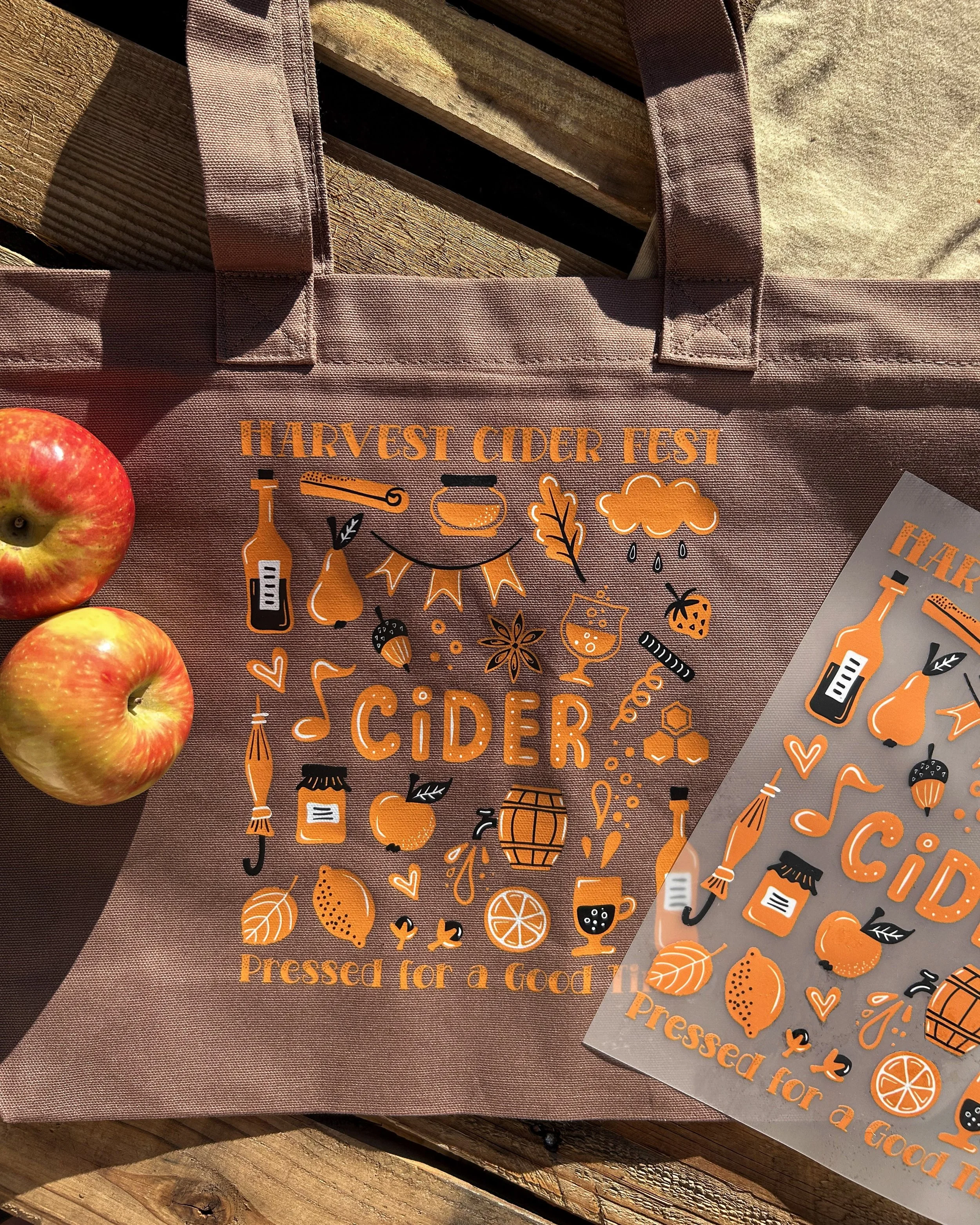
Harvest Cider Fest | colorVIBE DTF on an Espresso Comfort Colors tote.
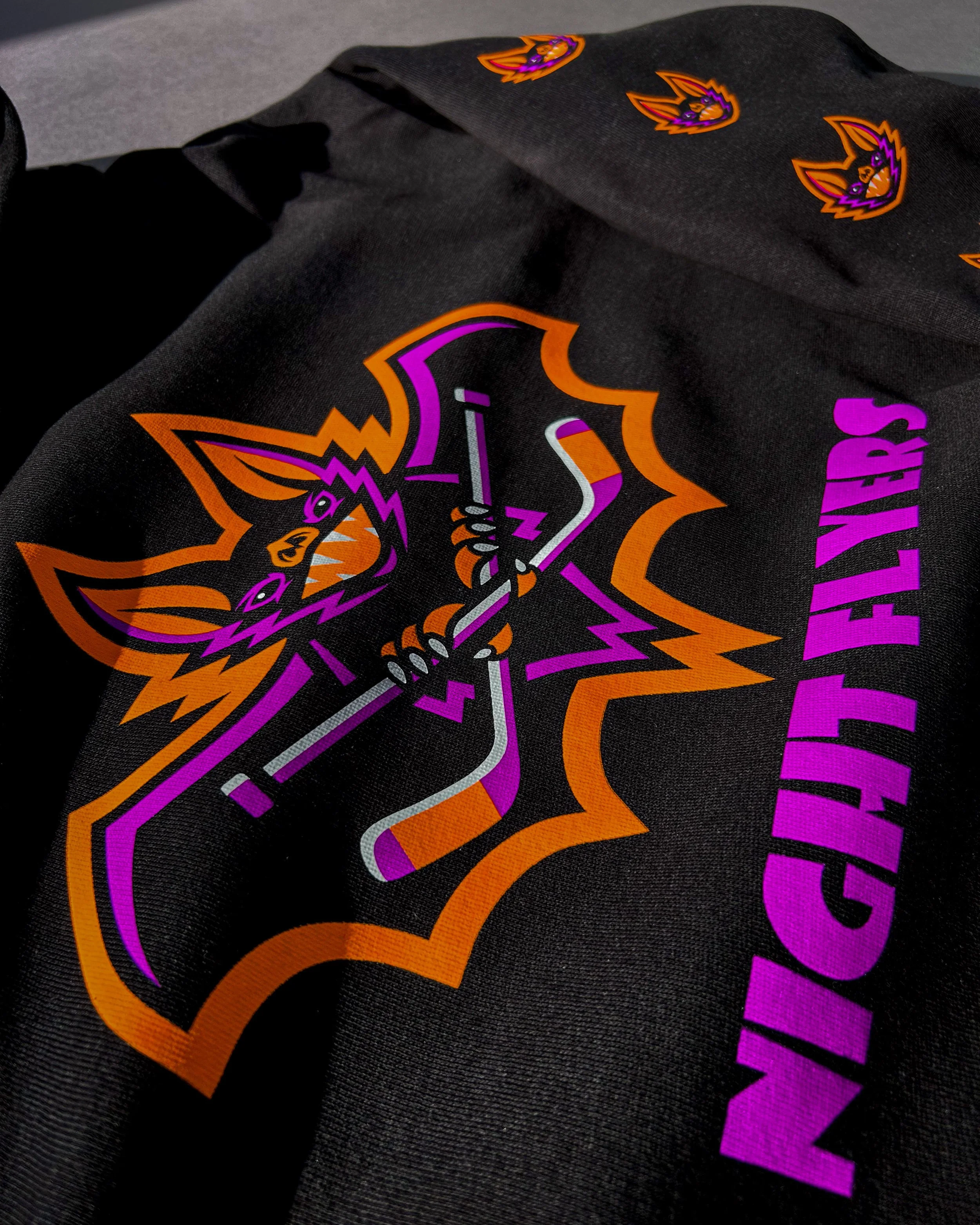
Night Flyers | Neon Howard Multi-Purpose on a black Lane Seven Urban Hoodie.
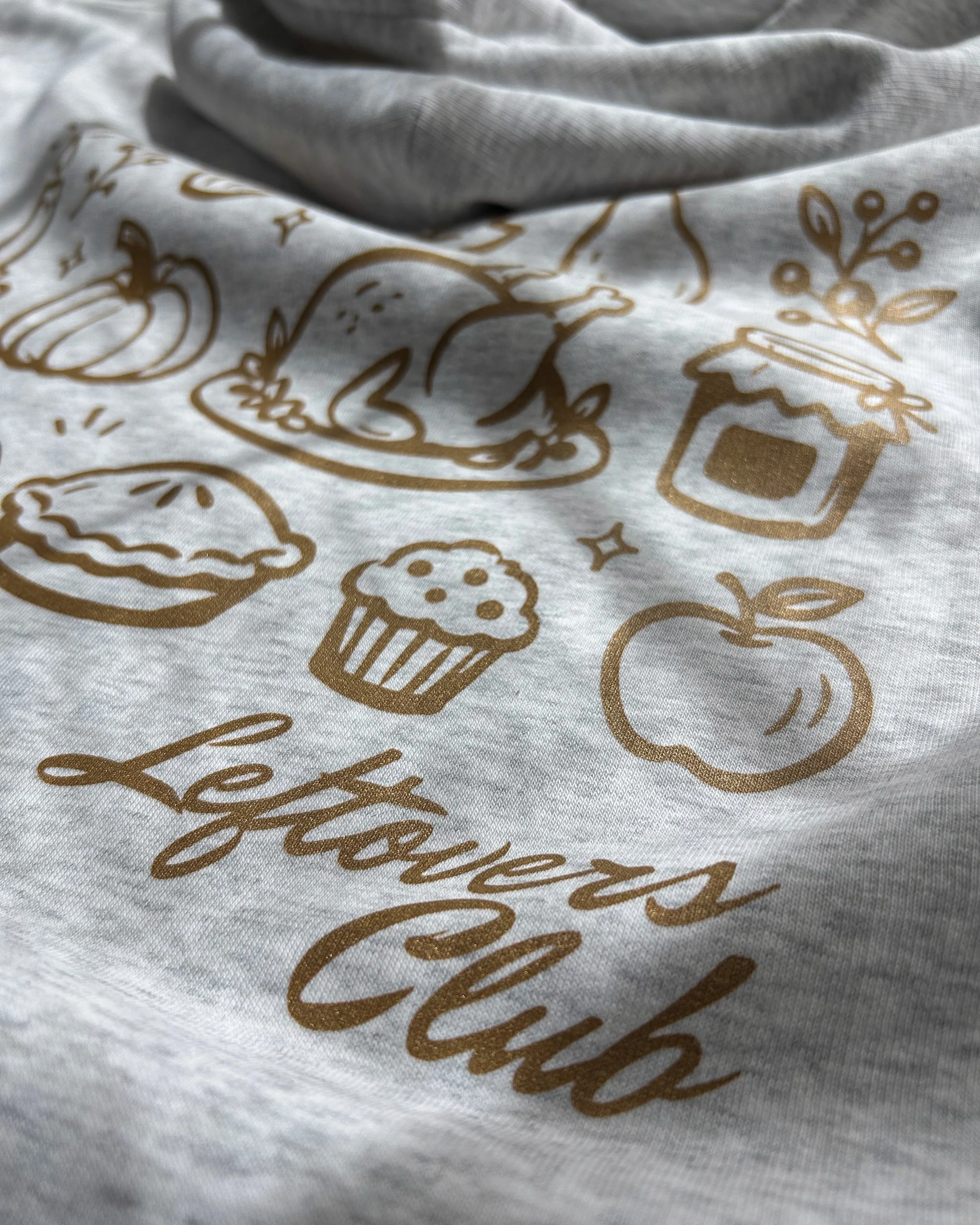
The Leftovers Club | Howard Hot Peel in Copper Shimmer on a Cool Heather Grey Stanley/Stella hoodie.
Wearable does not have to whisper
Removing obvious holiday language isn't enough. A design can dodge every cliche and still put the viewer to sleep.
Wearability comes from specificity: a stronger name, a clear audience and one visual decision people can recognize from across the pumpkin patch. Don't hide the season. Give the design enough identity that the season isn't doing all the work.
Five questions to ask before the art is finished
| Question | What it protects against |
|---|---|
| Who is this for beyond the holiday? | A broad concept with no clear buyer |
| What does the design belong to? | Artwork with no identity or story |
| Which detail creates the seasonal mood? | Competing icons and messages |
| Would it still work without the date? | An unnecessarily short wear window |
| How should the print look or feel? | A print choice that works against the concept |
Keep fall in the design without trapping it there
The best seasonal merchandise doesn't pretend it has no idea what month it is. It simply gives people more to connect with than the month.
Start with the wearer. Build an identity. Choose the fall cues with intention. Then select the transfer and garment that complete the idea. When those decisions work together, the product can smell like cider, glow like rink lights or celebrate the leftovers without disappearing when the calendar turns.
Frequently asked questions
Should seasonal merchandise avoid dates?
Not always. Dates can strengthen true event merchandise and commemorative pieces. Keep them secondary when the design should remain wearable beyond a single year, or create an easy-to-update date element for recurring programs.
How many seasonal elements should a design use?
There's no fixed number, but every element should earn its place. One strong identity anchor and one or two clear seasonal signals are often more effective than a crowd of equally loud symbols.
Can a seasonal design still be bold?
Absolutely. Bold color, large placement, unusual lettering and specialty finishes can make seasonal merchandise more compelling. The key is giving that impact to a distinct concept instead of relying only on familiar holiday imagery.
What is the difference between seasonal merch and holiday merch?
Holiday merch is tied directly to a specific celebration. Seasonal merch can draw from the weather, colors, activities, events and shared experiences surrounding a broader time of year, which often gives it a longer selling and wearing window.