
5 Ways to Print Camo Without Fighting the Pattern
Nothing tests a design’s survival skills quite like dropping it into a forest of Realtree.
The best way to print camouflage apparel is to decide what the artwork must accomplish before choosing the transfer. Use purposeful contrast for immediate visibility, stronger hierarchy for clean readability, Puff for tonal dimension, Vintage Wash for intentional show-through, or a controlled sample comparison when the finish is still open.
HCT built this guide from four printed camo concepts and a same-art comparison across Howard Multi-Purpose, Puff, and Vintage Wash. The finished garments showed how color, scale, texture, and transparency change the relationship between a design and a busy pattern.
Each approach answers a different decorator question. Start with the result the customer needs, then use the section that matches the job. See the finished pieces together in The Camo Collection.
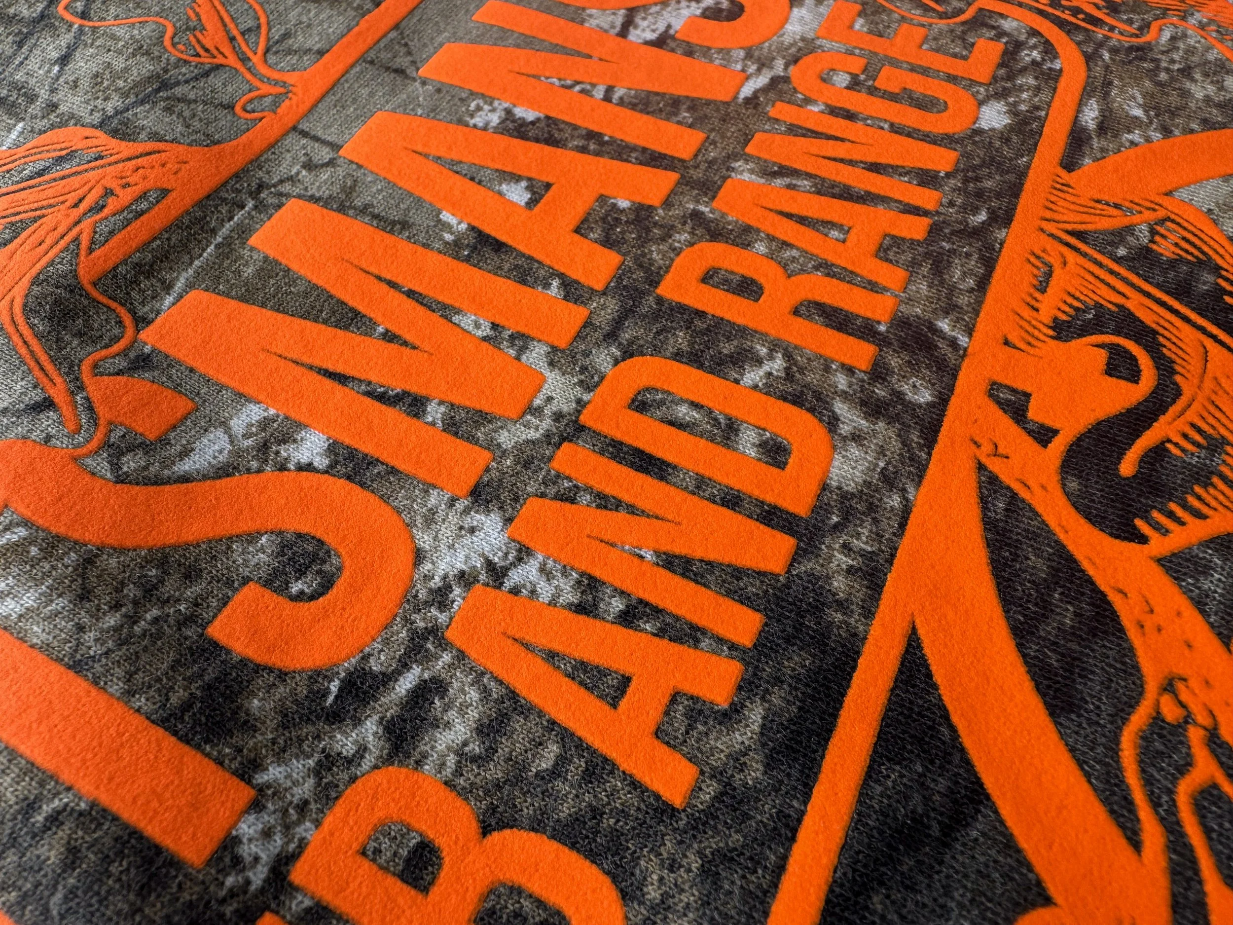
Neon Orange Howard Multi-Purpose on a Russell Outdoors™ Realtree EDGE® Performance Tee.
1. Use Contrast With a Purpose
Bright ink will get attention. The harder question is whether it belongs on the shirt.
Neon Orange works for the Sportsmans Hunt Club and Range tee because the customer is a hunting and range organization. Against the detailed Realtree EDGE pattern, the color helps the name stand out while the branches, antlers, and target stay connected to the project. The orange has a reason to be there beyond rescuing the design from a busy background.
HCT Production Artist Adam Palfi looks at contrast through the audience first. “Keep your target audience in mind. For a traditional look, stick to familiar colors like bright orange and white. If you’re thinking outside the box of traditional camo wear, make sure the bright colors still work within the shades and tones of the camo pattern.”
Before selecting a high-contrast color, put the artwork over the actual print area of the garment. Look at its lightest and darkest patches. A color that jumps off one section may have less separation on another. Make the customer name or primary message readable first, then decide how much illustrative detail the design can carry. If the orange were removed from the Sportsmans tee, the antlers and branches would still make sense for that customer. That’s a better test of the concept than asking whether neon pops.
Use this approach when the brand, event, or audience gives a bold color a natural role and the main message needs an immediate read.
2. Give the Eye One Clear First Read
A camouflage blank already contains a lot of visual information. The print doesn’t have to match it detail for detail.
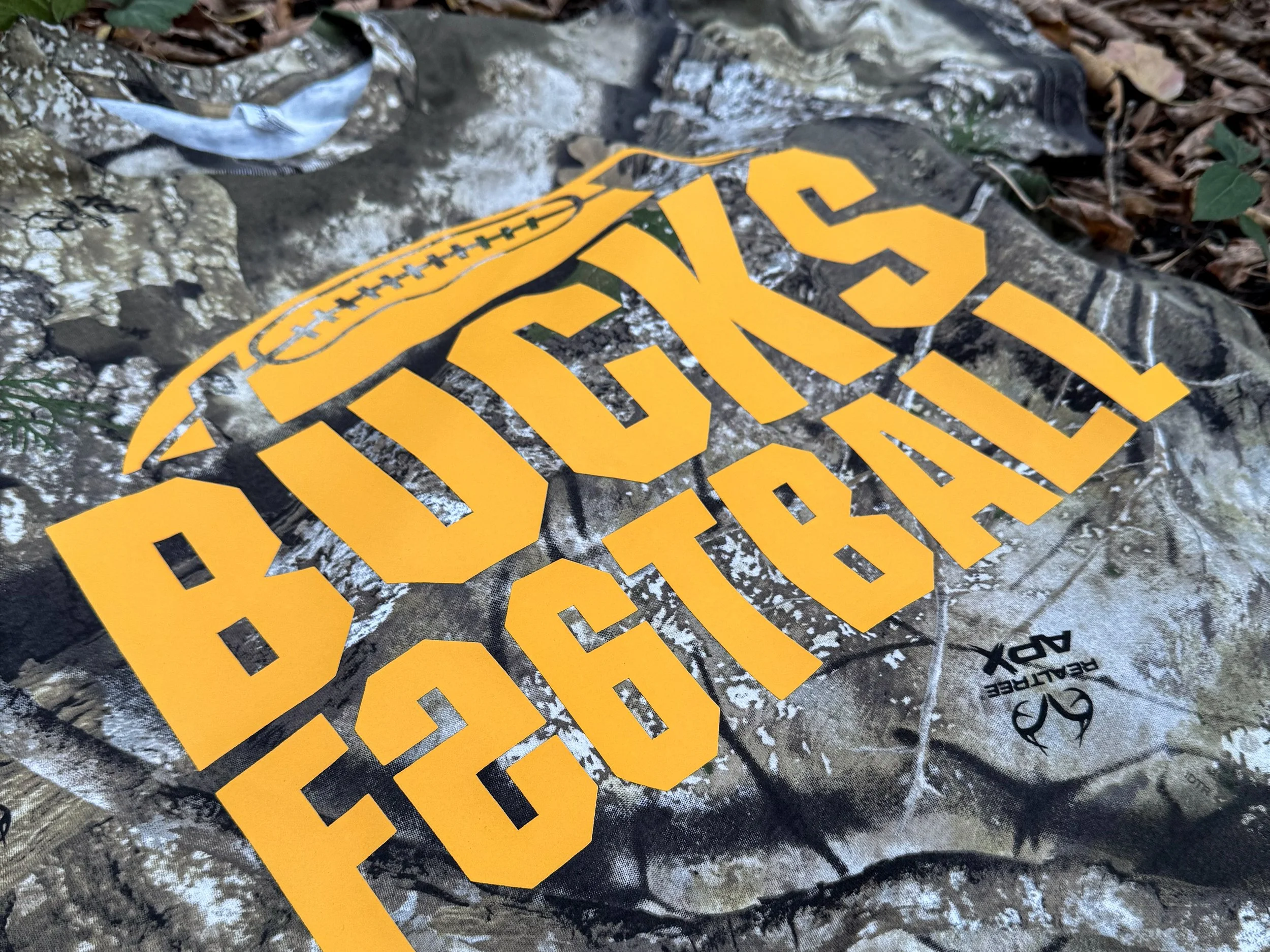
The Bucks Football design uses oversized athletic lettering, a football outline, and one Athletic Gold Howard Multi-Purpose print. For this particular garment, HCT used a specially formulated dye-blocking layer beneath the print. It isn’t a standard menu option, so specialty applications should be discussed with HCT. The graphic has a clear identity before someone notices the Realtree APX behind it. More small text or extra motifs would create another thing for the eye to sort out.
For Adam, a strong focal point gives camo design depth. “Your logo or design should appear in front of the camo background as the main attraction, while the camo works as the complementary portion.”
Try viewing the artwork as a small thumbnail. Can you still read the team, business, or event name? Then view it at the size and distance from which someone would see the garment in real life. If the message disappears on your screen, the pattern won’t help it reappear. Increase type weight, simplify competing details, or give the focal point more breathing room. The Bucks shirt would be a football shirt even on a solid blank. Realtree APX changes its energy, not its allegiance.
Use this approach when a team name, logo, or essential message must stay clear across a busy print. The garment can provide the complexity; the artwork can provide the hierarchy.
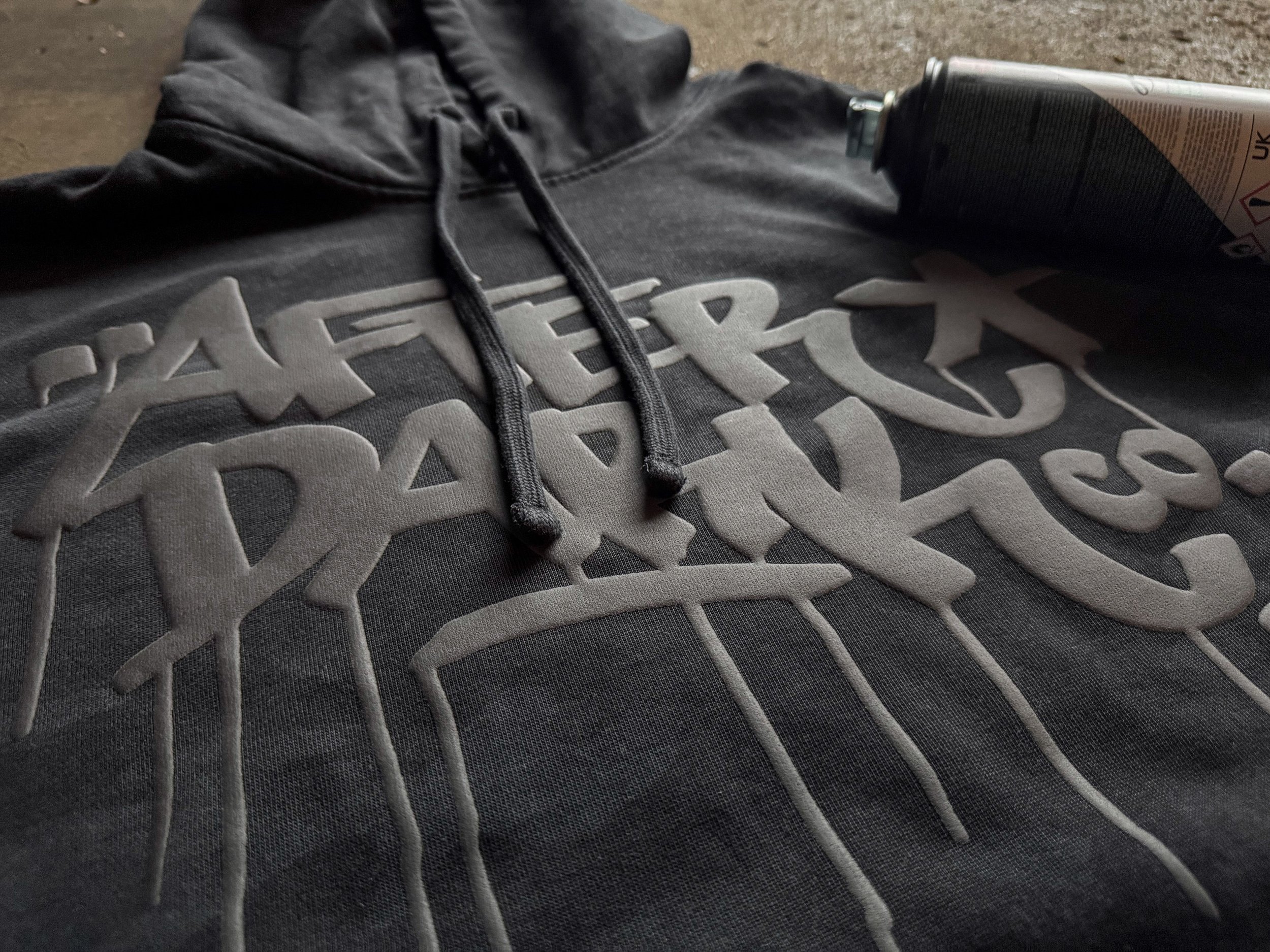
Black Puff on a District Wash™ Camo Fleece Hoodie.
3. Let Texture Create Separation
There’s more than one way to make a graphic visible. A tonal print can rely on its surface as well as its color.
After Dark Co. uses Black Puff on a black camo District hoodie. The bold graffiti-inspired mark stays within the hoodie’s dark palette, while the raised finish gives the lettering a physical presence. The design still needs enough size and shape for that dimension to matter. Extremely fine details may not produce the same effect as a broader letter or icon.
With Puff, Adam pays extra attention to spacing. “Give yourself adequate space between larger details so the Puff can really expand. Enough separation creates that fun, raised look you can see and feel without the Puff bleeding into parts you didn’t want touching.”
Consider how the piece will be seen and photographed. Straight-on light can flatten a raised print in an image, while a close crop with light across the surface can show the dimension. Judge the actual sample in person, too; a photograph is a poor substitute for feeling the finish. If the mark becomes unreadable without the right camera angle, make the lettering bolder before asking Puff to save it.
Use this approach when the customer wants a tonal, tactile piece and a louder ink color would change its identity.
4. Let the Pattern Show Through on Purpose
An opaque print isn’t always the goal. Sometimes the most interesting part of the garment deserves a place inside the graphic.
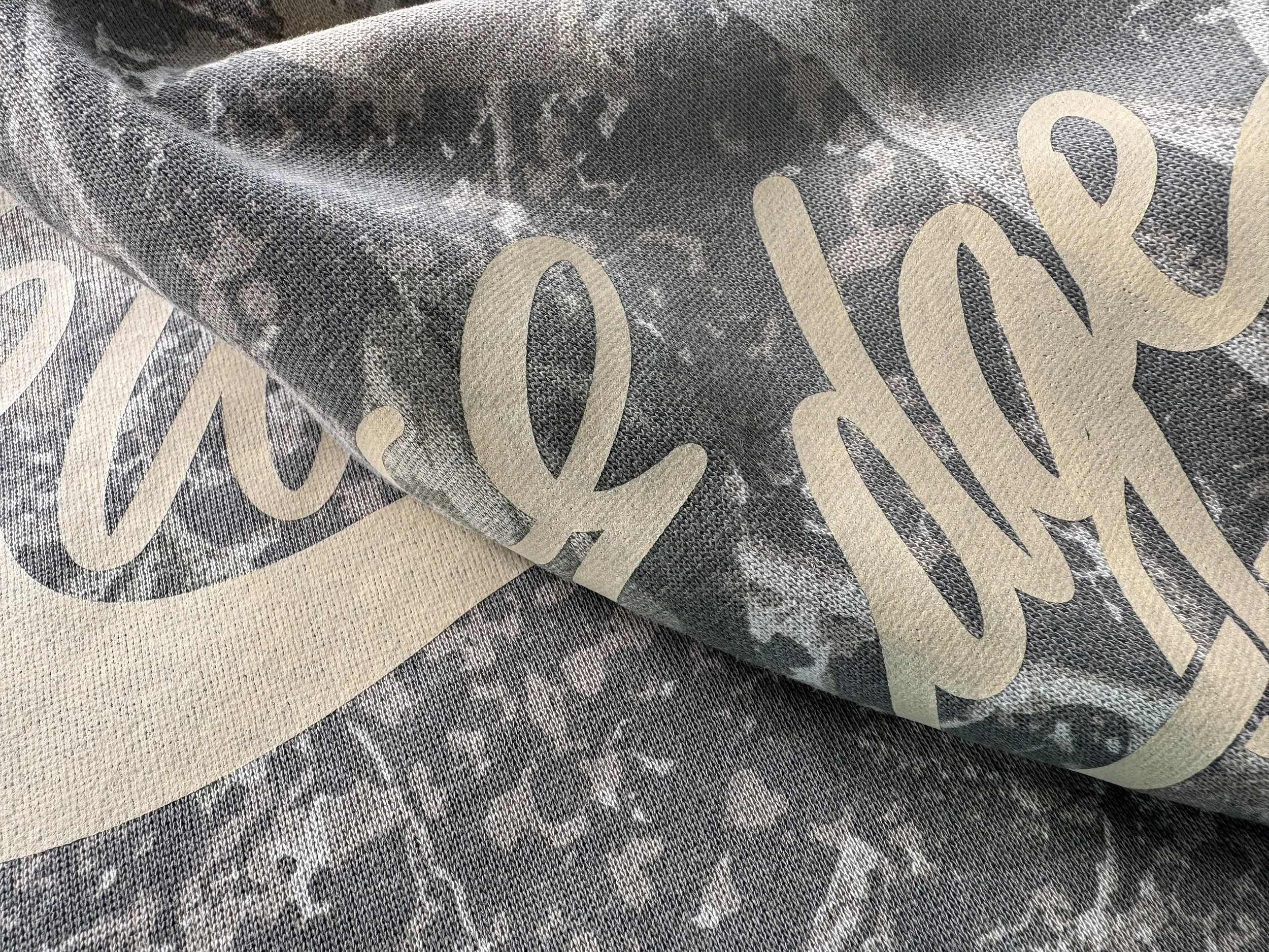
Woods Edge Winery uses one-color Light Tan Vintage Wash on a Deadwood Tree camo crewneck. Its broad, sweeping script supplies a readable name; the semi-transparent transfer allows the pattern to influence the finished artwork. For a vintage destination-merch direction, that variation is part of the appeal.
Adam likes how intentional show-through can change the feel of the entire piece. “Letting the pattern come through lends itself to an old-school, worn-in look. It can create more of a ‘come check my shirt out’ effect than something that needs to be seen from 30 yards away.”
Transparency calls for restraint. Check how the important letters read over both light and dark portions of the garment. If the project depends on tiny sponsor names or consistently bright lettering, letting a changing background through may work against the assignment. If the pattern makes a softer graphic more appealing, give it room to participate.
Use this approach when the customer wants a worn-in look and the camo showing through improves the design.
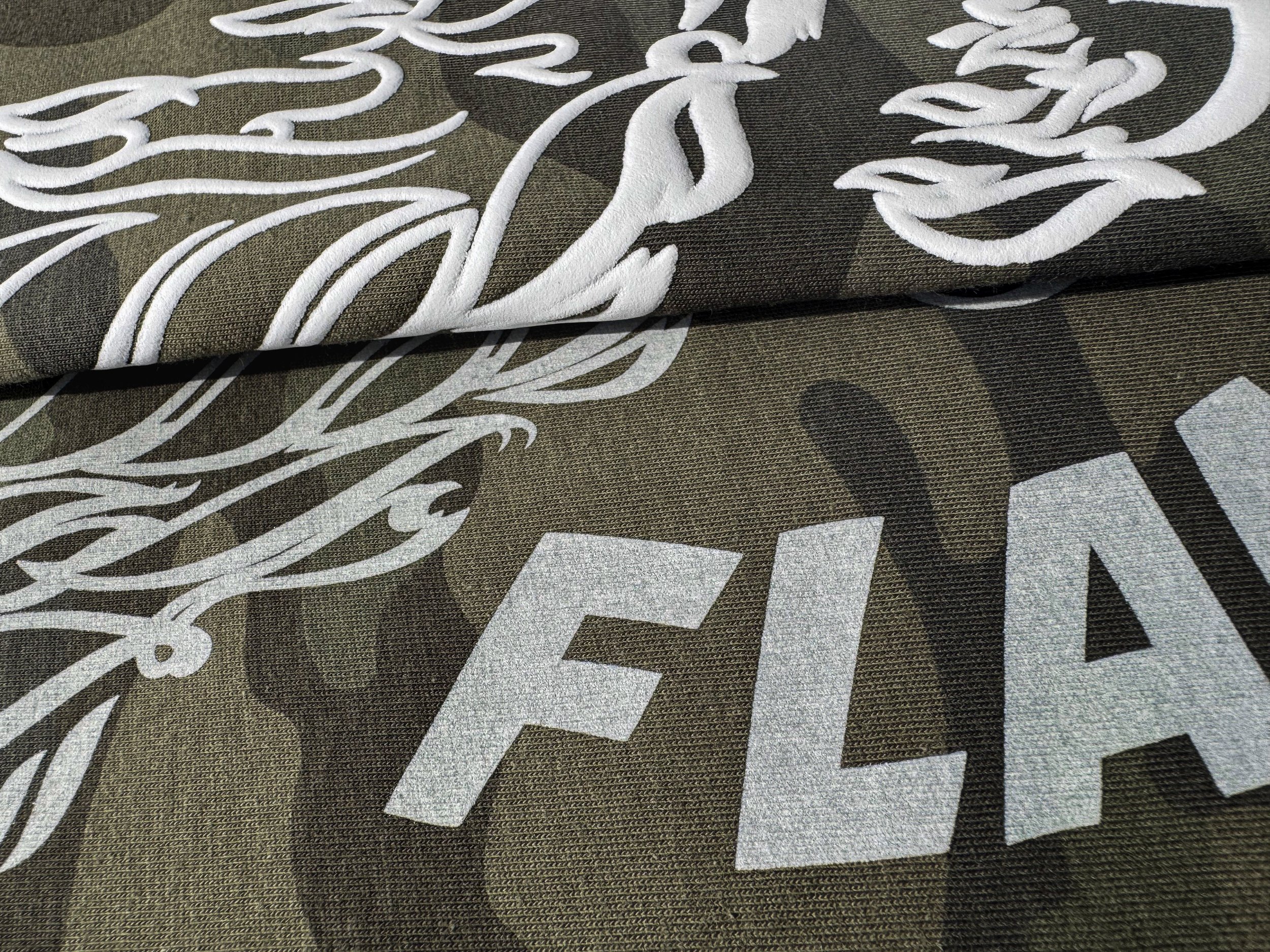
White Puff and Vintage Wash compared on matching Independent Trading Co. Premium 180gsm Short Sleeve T-Shirts in Forest Camo.
5. Test the Same Artwork in Different Finishes
A mockup can tell you whether the composition works. It can’t tell you which printed surface feels right for the customer. One controlled comparison is often more useful than another round of adjectives.
In HCT’s printed comparison, the Flame Throwers B.C. baseball artwork appears in white on three matching Forest Camo shirts. Howard Multi-Purpose gives the flames and lettering a flat, classic screen-print look. Puff raises the graphic from the shirt. Vintage Wash lets the camo influence the white through its semi-transparent finish. The design, garment style, and ink color stay the same; the transfer changes the relationship between the mark and the pattern.
The finish can affect more than the look. Palfi sees an opportunity to increase perceived value. “A standard print might be status quo for pricing, but once you get a little fancier with Puff, the same design looks elevated, literally, and becomes more of a statement piece. Vintage can create its own value with the softer hand feel people love on a thin, gentle blank.”
Show the versions side by side, labeled clearly, and ask what the team would actually wear. Does the name need the cleanest first read? Would raised flames make the merch feel more special? Does a worn-in, pattern-rich print fit this club better? The answer comes from the project, not a universal ranking of finishes.
Use this approach when the artwork is set, but the finish is still an open creative decision. Press and compare samples on the intended garment before placing the larger order.
Make the Choice on the Actual Shirt
Before ordering, study the garment’s print-area pattern and view the artwork at its intended size. Decide whether the print needs coverage, texture, or deliberate pattern show-through. Then choose a transfer designed for that result and test a sample on the actual garment. Use HCT’s application instructions for the selected product; a different solid tee or digital mockup won’t show the complete interaction between the artwork and this camo pattern.
| If the design needs... | Check first | Direction to consider |
|---|---|---|
| Immediate visibility | Is the main message readable over light and dark patches? | Purposeful high-contrast ink and a strong focal point |
| A clear mark on busy camo | Does the artwork still read at a small size? | Larger type, simpler details, and appropriate opacity |
| A dark tonal finish | Are the shapes broad enough to show texture? | Puff and a close look at the actual sample |
| One design with several possible finishes | Can you compare printed samples on the same garment? | Make a controlled Howard Multi-Purpose, Puff, and Vintage Wash test |
| A soft, integrated print | Can the essential lettering tolerate some pattern show-through? | Semi-transparent Vintage Wash |
There isn’t one best heat transfer for every camouflage garment. There’s a best next decision for the market, artwork, garment, and result in front of you. See those choices in action across four finished concepts and one same-art experiment in The Camo Collection.
Frequently Asked Questions
What color print works best on camouflage?
No single color works on every camo pattern. Check the actual garment’s light and dark areas and the customer’s visual identity. Strong contrast can help important information read, while a tonal or semi-transparent print may be a deliberate style choice.
How do you choose between a flat print, Puff, and Vintage Wash on camo?
Start with the artwork and the customer’s goal. A flat Howard Multi-Purpose print gives a classic screen-print look; Puff adds dimension to broad shapes; Vintage Wash lets the pattern influence a softer graphic. Compare samples on the intended shirt, as with the Flame Throwers B.C. design.
Will the camo show through a transfer?
It depends on the product. An opaque print aims for stronger coverage. A semi-transparent finish such as Vintage Wash is intended to let the garment influence the artwork.
Can you print black on black camo?
Yes. Make sure the artwork has another source of separation, such as scale, shape, or texture. Black Puff on the After Dark Co. hoodie is one way to build a tonal piece around dimension.
Should you test a heat transfer on the actual camo garment?
Yes. A solid shirt or digital mockup can’t show how the artwork will interact with the camo pattern, garment construction, opacity, and finish. Test the selected transfer on the intended garment whenever possible, then follow HCT’s application instructions for that product.
Use these five approaches to narrow the direction, then visit the full Camo Collection report to compare how contrast, opacity, dimension, and intentional show-through look in action.