
The Camo Collection: Four Merch Concepts and One Three-Finish Experiment
Camo has spent enough time being typecast.
The best way to print camo apparel is to decide what the finished piece needs to communicate, then choose a transfer that solves that specific visual problem. Purposeful contrast, strong hierarchy, raised texture, and intentional transparency can each give the pattern a completely different job.
That job changes with the market. A hunting club may want immediate visibility. A football team needs an unmistakable team mark. A streetwear label can build around subtle texture. A winery can let the pattern contribute to a softer souvenir feel.
For The Camo Collection, HCT printed four camo merch concepts using four garments and three transfer products. Each piece has its own identity, but the collection is connected by one question: What happens when the transfer choice is part of the creative idea from the beginning?
Four Projects, Four Different Answers
| Project | Garment | Transfer approach | The design challenge |
|---|---|---|---|
| Sportsmans Hunt Club and Range | Russell Outdoors™ Realtree® Performance Tee RU150 in Realtree EDGE | Neon Orange Howard Multi-Purpose | Make a detailed outdoor graphic visible on busy camo |
| Bucks Football | Independent Trading Co. PRM180PT Tee in Realtree APX | Athletic Gold Howard Multi-Purpose | Make camo feel at home in spirit wear |
| After Dark Co. | District Wash™ Camo Fleece Hoodie DT2200C in Black | Black Puff | Create a tonal streetwear graphic with dimension |
| Woods Edge Winery | Independent Trading Co. IND3000 Heavyweight Crew in Deadwood Tree Camo | Light Tan Vintage Wash | Make the garment pattern part of a vintage look |
The transfer products solve different visual problems, and the artwork gives each choice a reason to exist. Across the four finished concepts, color, hierarchy, texture, and transparency all change how the print works with the camo beneath it. Here’s what HCT learned from each one.
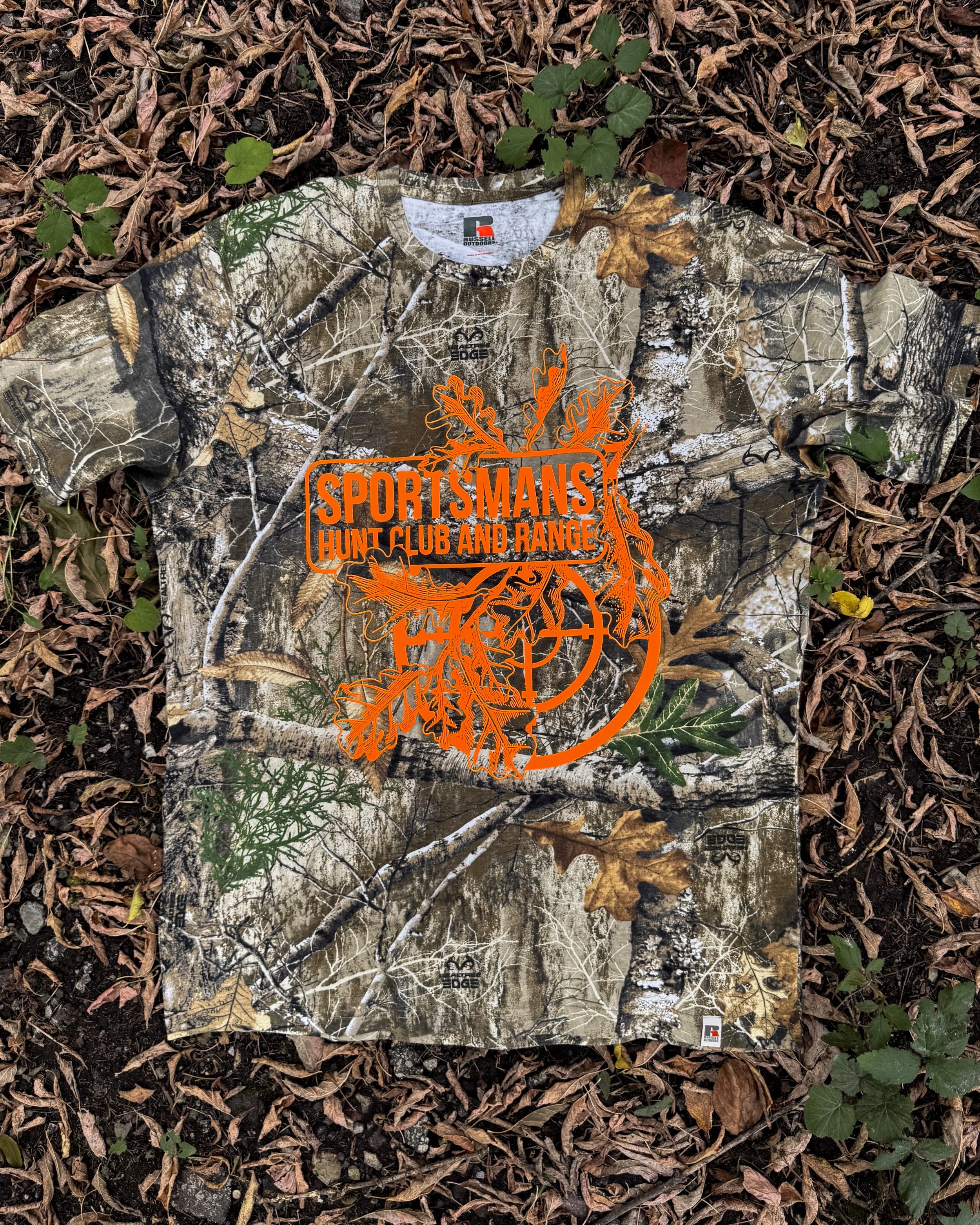
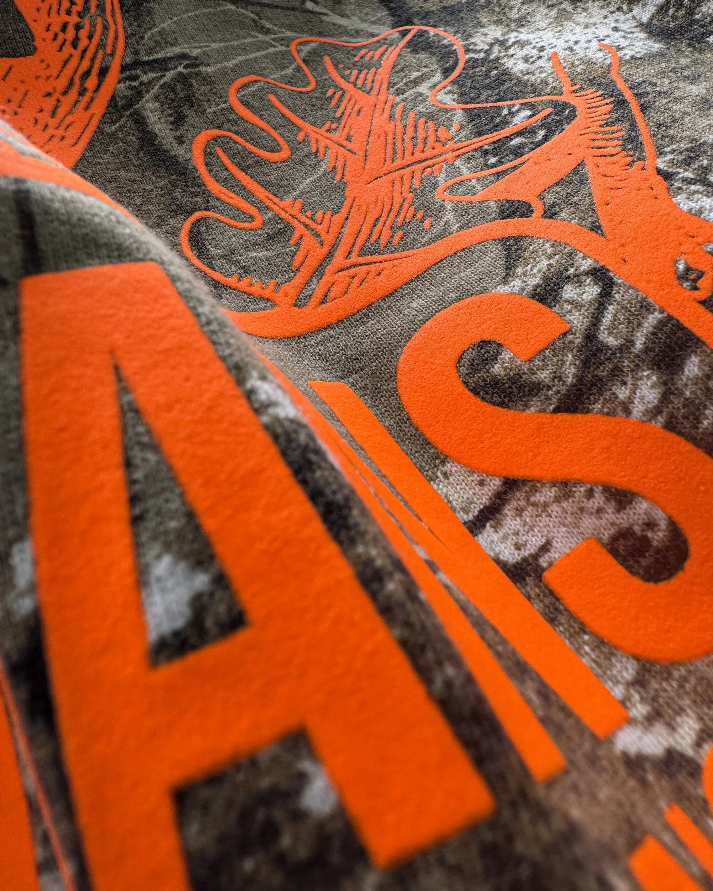
1. Sportsmans Hunt Club and Range: Orange With a Job to Do
Realtree EDGE gives this shirt a whole woodland scene before a transfer touches it. Branches cross the chest, light patches break up the background, and the print has to find a way through.
Sportsmans Hunt Club and Range answers with a Neon Orange Howard Multi-Purpose print. The name runs through the center of an illustrated mix of antlers, branches, and a target, so there's an immediate message and a second layer to explore. On a hunting and range tee, that orange feels connected to the customer. It isn't a random pop of color chosen to rescue a busy design.
The strongest part of the pairing is that the artwork still has structure. A viewer can find the name first, then notice the finer outdoor details. Color gets their attention; the composition tells them where to look.
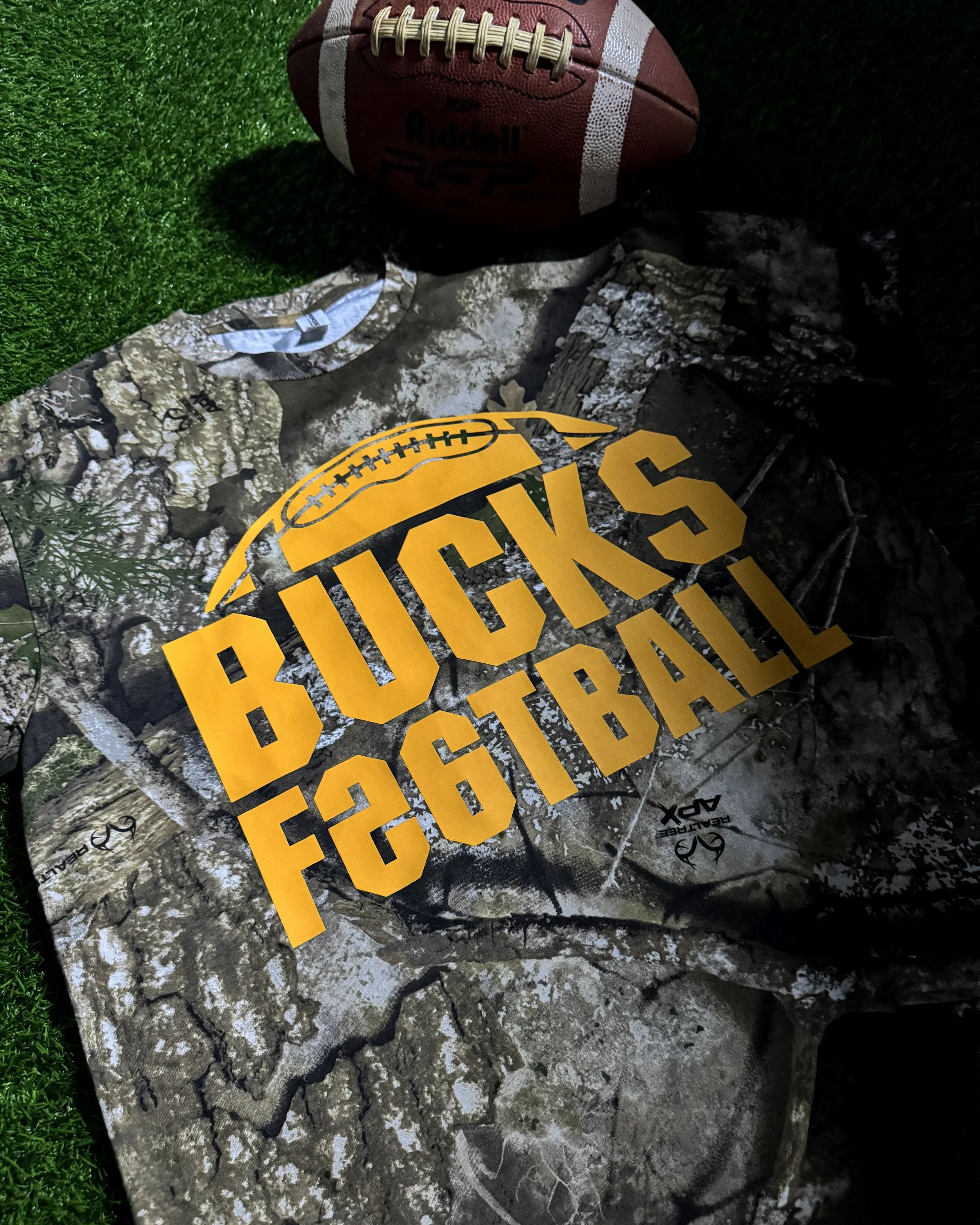
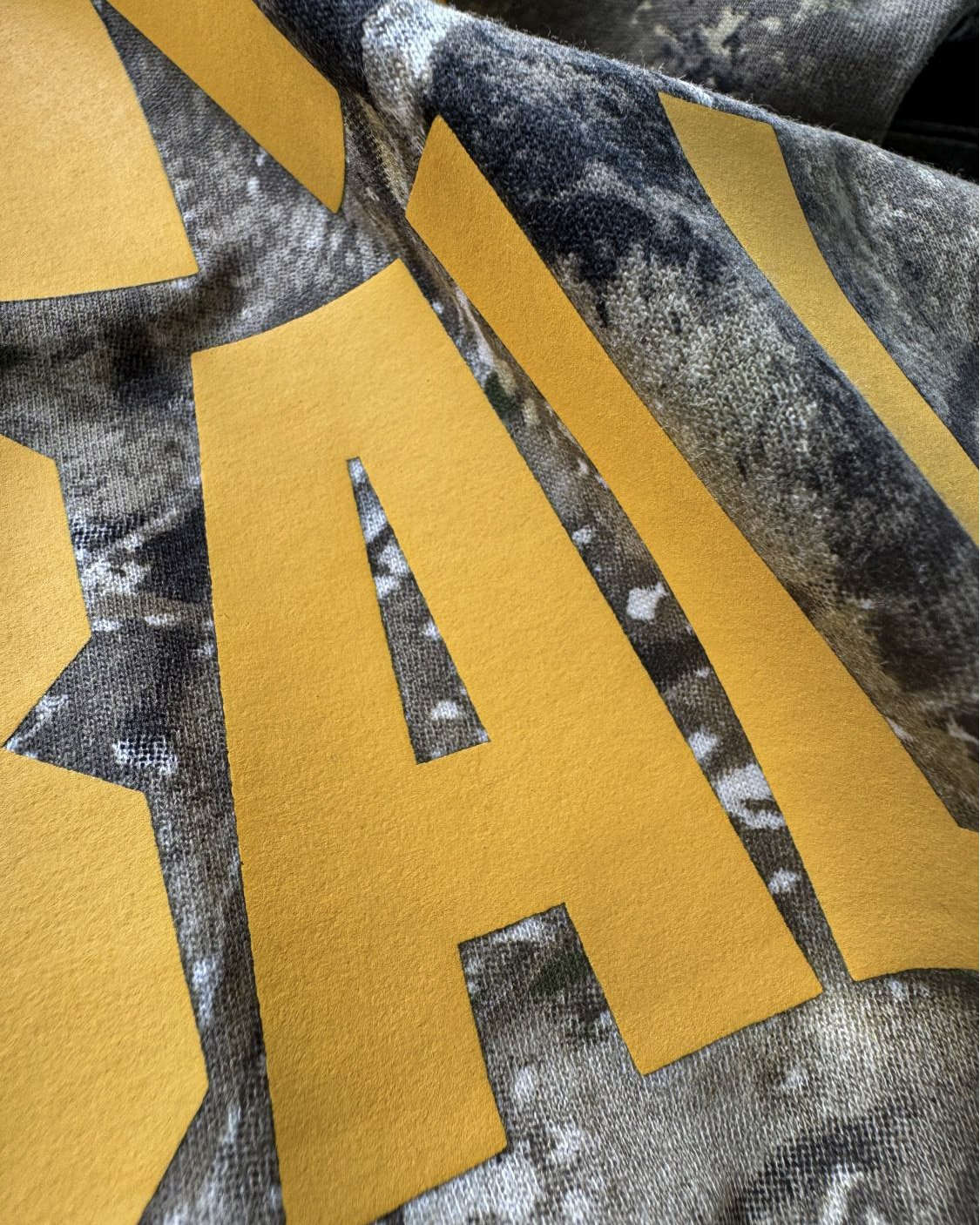
2. Bucks Football: A Team Shirt First
The oversized BUCKS FOOTBALL lettering and football outline claim the center of this Realtree APX tee. You don't have to decode the pattern to know who the shirt is for.
Athletic Gold Howard Multi-Purpose keeps the graphic in familiar team territory. For this specific build, HCT also used a specially formulated dye-blocking layer beneath the print. It isn’t a standard menu option, but it was selected for the needs of this garment.
The artwork doesn't borrow antlers, trees, or outdoor slogans just because the garment happens to be camo. That's what makes the pairing interesting: a straightforward football print gets a more surprising canvas without losing its identity as spirit wear.
One color and a strong shape give the eye somewhere to land. Adding more to the graphic would ask it to compete with the detailed garment, when the tee is already doing plenty of visual work.
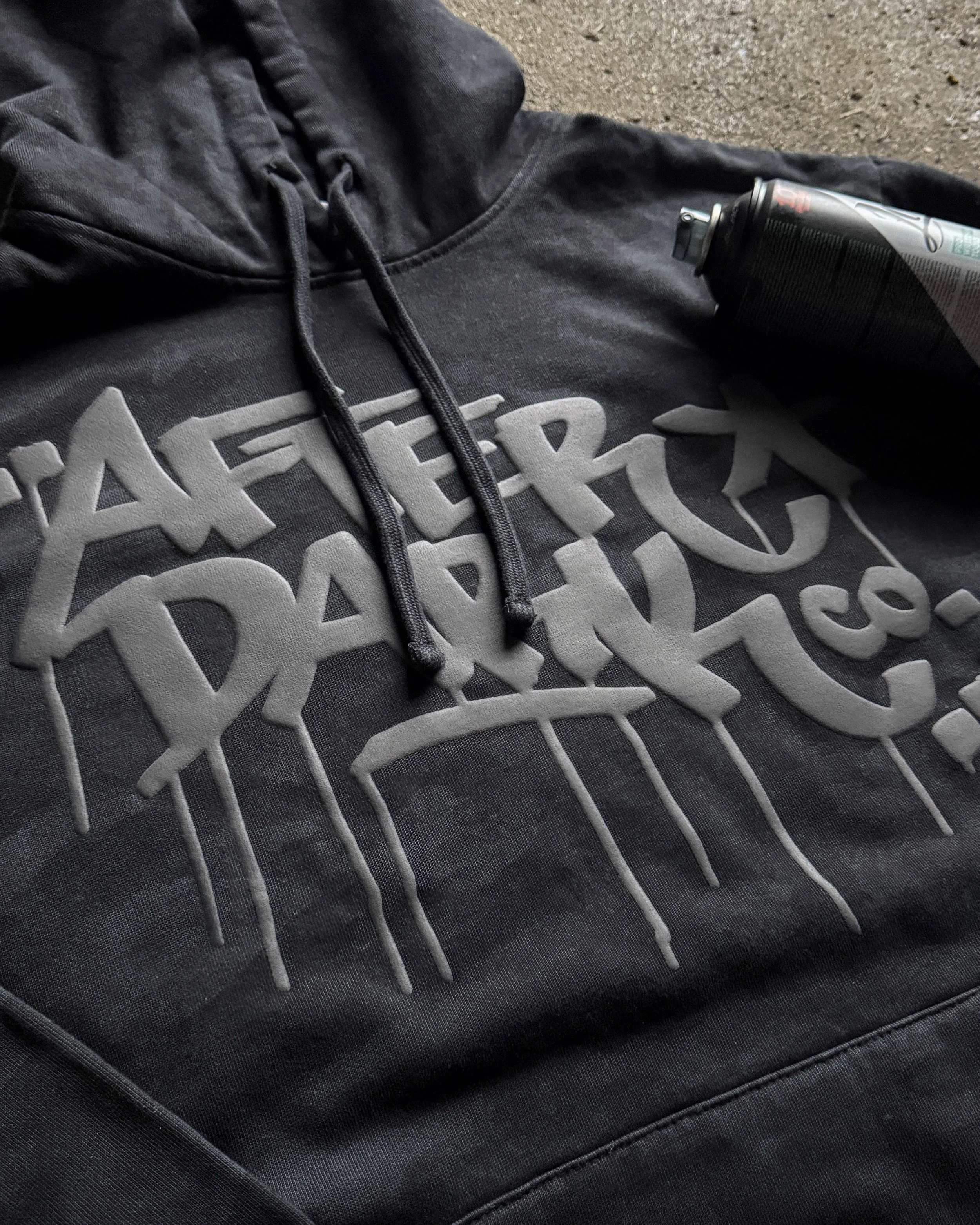
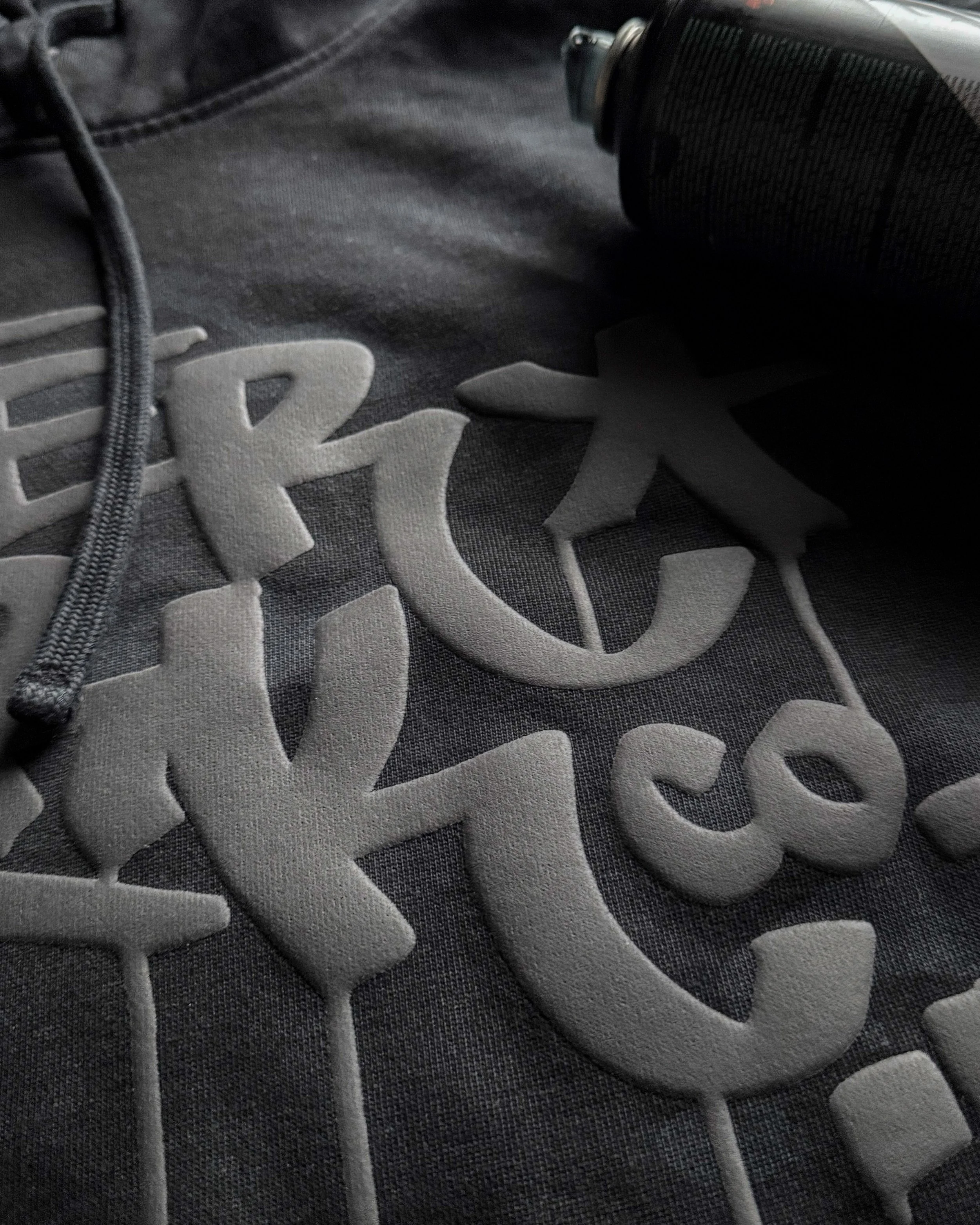
3. After Dark Co.: Let the Lettering Rise
After Dark Co. keeps its palette almost stubbornly dark. Black graffiti-inspired lettering sits on a black camo District hoodie, with no bright outline added to make the design announce itself from across the room.
Black Puff gives the lettering a different way to register. Its raised surface belongs to the mark's bold, loose shapes and makes the print worth a closer look. A flat, high-contrast graphic would tell a louder story. This one is built around the pleasure of noticing the detail.
The hoodie shows what a finish can contribute when it's chosen with the artwork, not after it. The black camo sets the mood; the Puff gives the mark a physical presence within it.
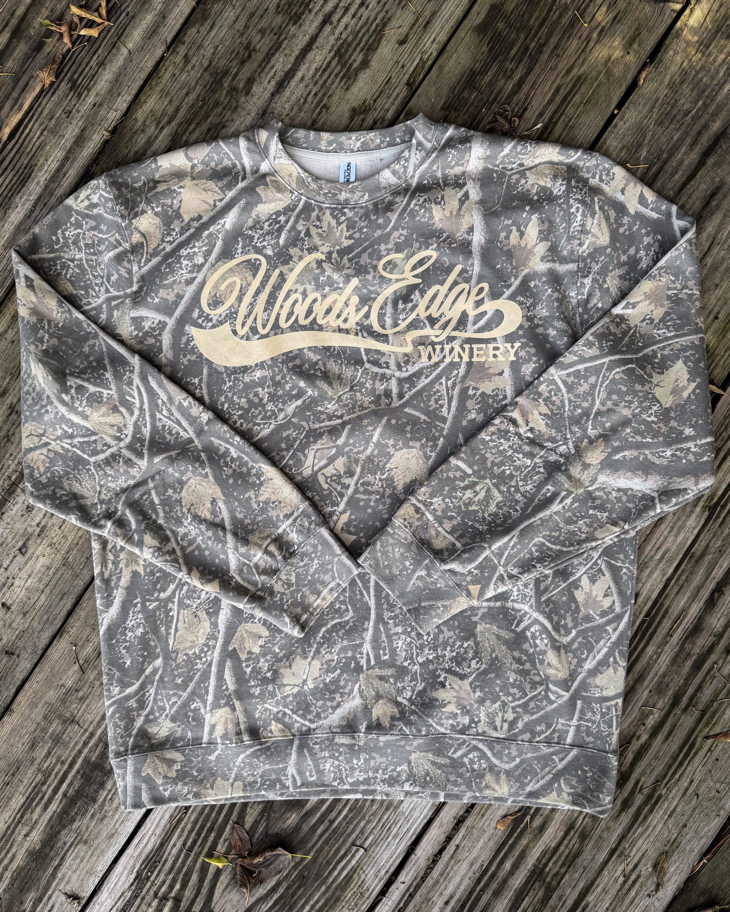
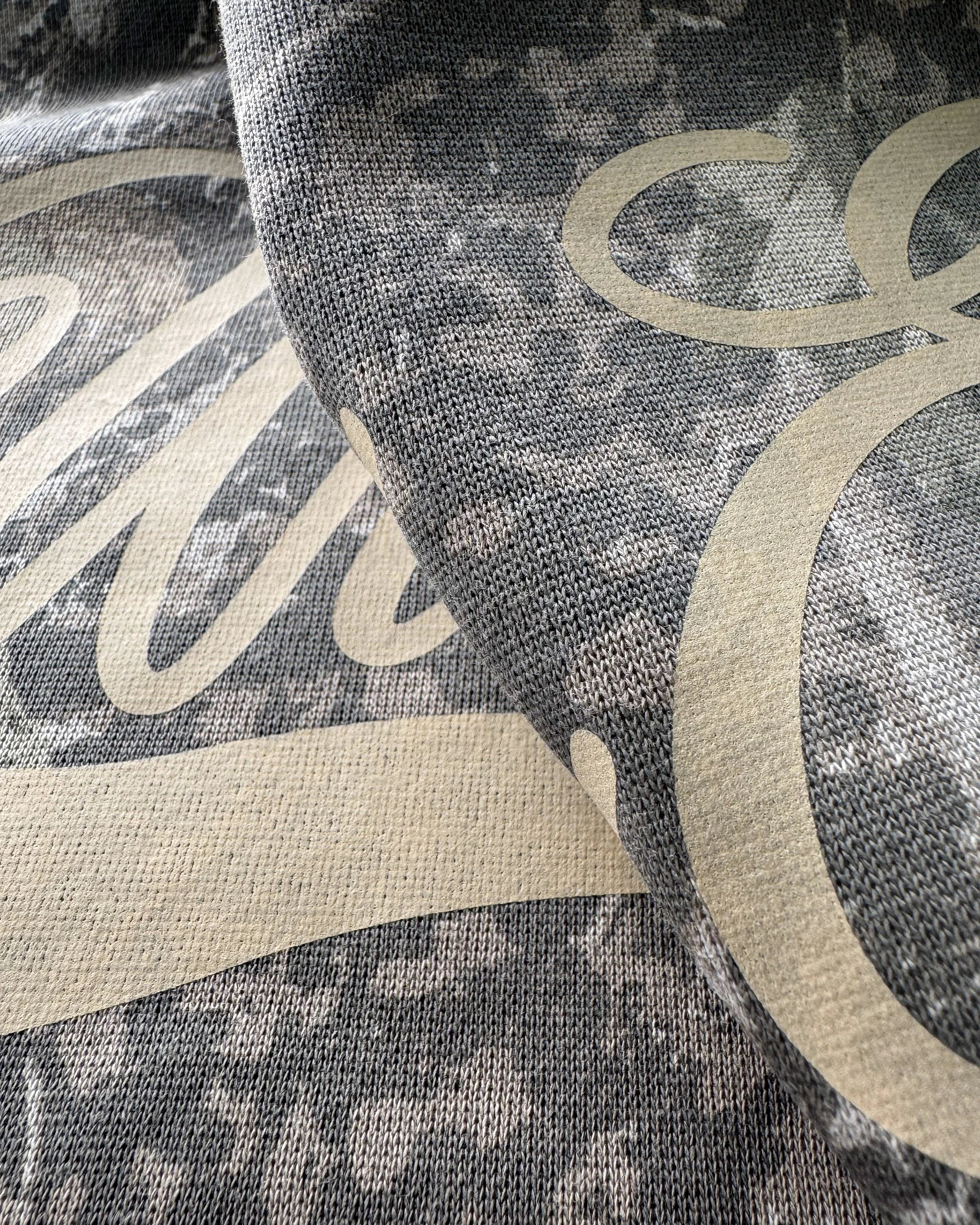
4. Woods Edge Winery: A Souvenir With Some Staying Power
Woods Edge Winery doesn't look like the obvious candidate for a camo crewneck, which is exactly why it earns a second look. A large, sweeping script gives the piece the feel of destination merch, while the Deadwood Tree pattern crewneck keeps it from becoming another winery sweatshirt on a solid blank.
One-color Light Tan Vintage Wash brings a softer, semi-transparent character to the print. Instead of treating every branch beneath the artwork as something to hide, the design gives the garment room to influence its appearance. The script still has a clear job: make the name memorable.
It's an unusual pairing that makes sense as a piece someone could take home from a visit and wear long after. The garment supplies the outdoorsy note; the lettering keeps the winery at the center of the story.
Same Pattern Category, Different Merch Stories
Put these pieces side by side and the hunting tee isn't the template for the other three. Bucks Football stays unmistakably athletic. After Dark Co. rewards a closer look. Woods Edge Winery lets script and pattern share the spotlight.
Each concept asks the transfer to do something specific. That’s why the collection feels like four project briefs built around camo for four different reasons, rather than one brand changing its logo and colorway.

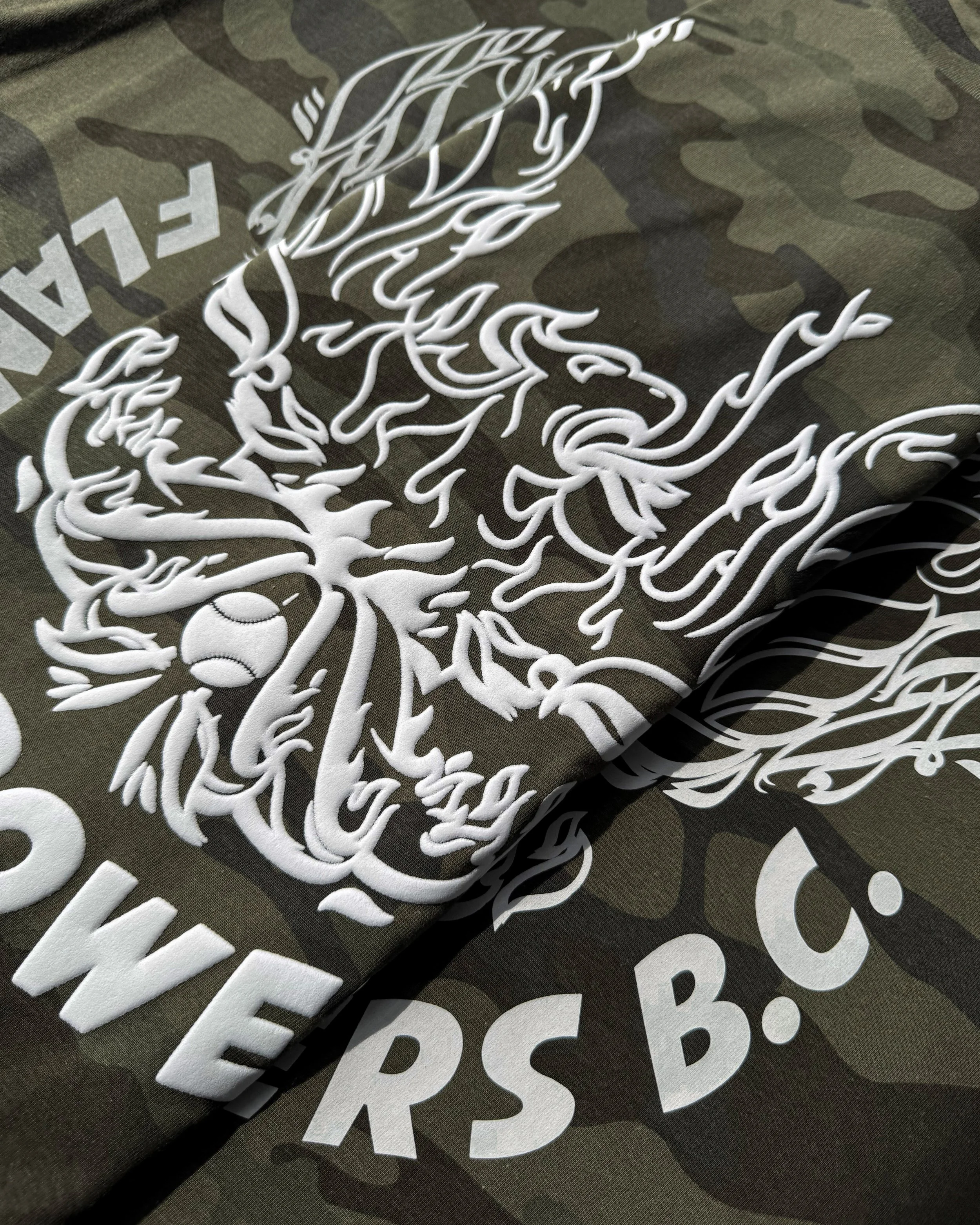
Bonus Experiment: Same Art, Three Very Different Finishes
Four finished merch concepts weren’t enough. HCT sent Flame Throwers B.C. back to the plate for one controlled comparison: the same baseball artwork, the same Forest Camo shirt, and the same white ink across three transfer finishes.
Howard Multi-Purpose delivers the clean, flat classic. Puff raises the flames and lettering from the shirt. Vintage Wash lets the camo influence the white through its semi-transparent finish. Nothing about the design changed. The personality did.
Line them up and the choice gets much more interesting. Should the team name read cleanly at a glance? Should the flames have a raised edge? Or should the pattern become part of the graphic? One design just turned into three completely different merch directions.
One pattern category just opened the door to several completely different merch directions. Open the full Camo Collection report to show customers what’s possible and start your next camo project with a stronger creative brief.