
Designing for Specialty Screen Print Transfers: A Q&A with a Former Production Artist
This article is part of our Print with Personality series, where we explore how specialty screen print transfers influence perception, positioning, and pricing in the decorated apparel industry.
Specialty finishes don’t fix bad design.
They amplify good design.
Over the past few articles, we’ve explored how Puff, Glow, Shimmer, Glitter, and Vintage Wash screen print transfers influence positioning and perceived value. But none of those finishes perform well if the artwork isn’t built to support them.
To go deeper, we sat down with Adam who began his career at Howard Custom Transfers as a production artist. We talked about what decorators often overlook when designing for specialty plastisol transfers.

Q&A with Adam
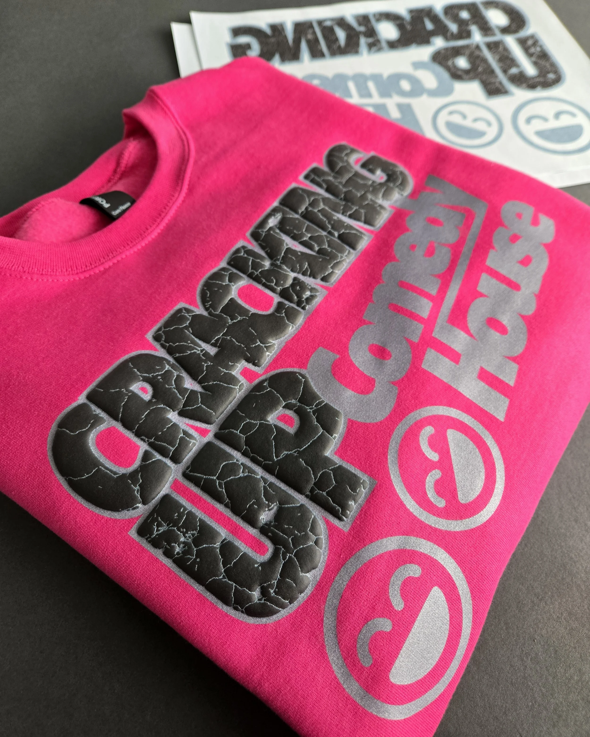
Q: What’s the most common mistake decorators make when designing for Puff screen print transfers?
Adam: Some designers can be a little timid when it comes to creating something truly unique. It’s okay to design outside the box. Yes, there can be challenges with spacing, gapping, and similar details, but working with Puff often involves a bit of experimentation to see what creates the best visual effect.
Consider the foreground and background, much like composing a good photograph. Emphasize the parts of the design you want to stand out instead of assuming the entire design needs to Puff. Mixing and matching finishes can help create depth and achieve more eye-catching compositional effects.
Q: How should artwork change when using Glow in the Dark screen print transfers?
Adam: Many designers start by saying, “I want this part to glow,” and build the design around that idea. While that approach can work, sometimes there’s an opportunity to take it further.
Think about what the viewer experiences. When the lights go off, what changes? Are there hidden details that only appear in the dark? Is the goal to surprise people, or to intensify the overall design?
I encourage artists to think of the glow effect as part of the full concept rather than adding it simply for the sake of making something glow. Lighter colors typically produce a stronger glow, while darker shades can be useful when you want more subtle details or contrast.
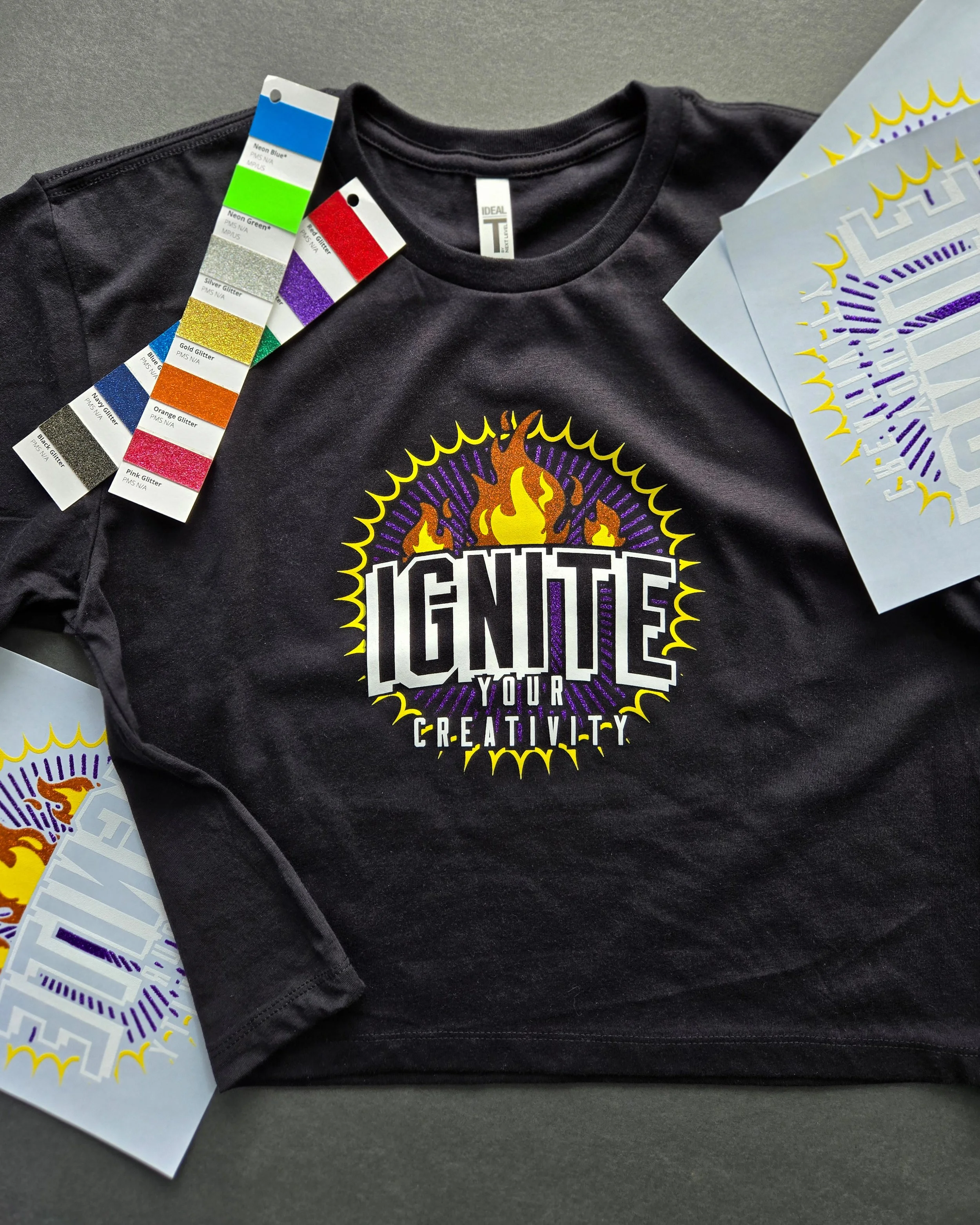
Q: What about Shimmer or Glitter transfers? Do they require different artwork considerations?
Adam: Glitter and Shimmer are two of my favorite finishes because I personally enjoy designs that shine and sparkle. When sunlight hits them, especially Glitter, they immediately catch the eye.
If you’re trying to make a bold statement, like cheering for your favorite sports team or representing something you love, Glitter can be a great choice. Shimmer, on the other hand, tends to feel more subtle and elegant. It adds just enough shine to elevate the design without overpowering it.
Shimmer can also bring more life into a design because it creates visual texture. The way the ink is composed can give the appearance of multiple shades within a single color.
Q: Vintage Wash is subtle compared to Puff or Glow. What should designers know?
Adam: Vintage Wash is a style that keeps coming back. If you want to create something that feels old-school or worn-in, it’s a great option.
This finish isn’t meant to be bold or in-your-face. It’s more classic and understated. One way to visualize it is to imagine your colors printed at about fifty percent opacity. Vintage Wash works especially well on darker garments, where the difference in saturation is more noticeable.
It’s also important to understand how the garment color affects the final look. For example, a Bright Red Vintage Wash print may appear closer to Cardinal Red on a dark shirt. The same red on a white shirt will look lighter. On a blue shirt, it might even lean slightly purple due to how the colors interact. These subtle shifts are part of the charm. Vintage Wash finishes can create unexpected color variations that add character to the design.
Q: If you could give decorators one universal rule for designing specialty screen print transfers, what would it be?
Adam: Don’t be scared! Let your creativity shine, literally. Be thoughtful and push beyond the standard box of traditional design. These specialty finishes can grab attention on their own, no matter what you’re creating.


The Strategic Takeaway
Specialty screen print transfers are powerful. But they’re not plug-and-play.
Puff needs structure.
Glow needs presence.
Shimmer needs contrast.
Vintage needs restraint.
When artwork and finish are aligned, the result feels elevated. When they’re not, the finish gets blamed for design problems it didn’t create.
Designing intentionally isn’t about adding complexity. It’s about understanding how the ink behaves and building around it.
That’s where specialty finishes become strategic.
Frequently Asked Questions About Designing for Specialty Screen Print Transfers
How do you design artwork for Puff screen printing?
Use thicker strokes, simplify small details, and allow space for ink expansion to maintain clean edges.
Does Glow in the Dark require special artwork adjustments?
Yes. Glow plastisol requires solid areas of coverage to charge and display effectively in low light.
Can detailed artwork work with Glitter or Ghimmer ink?
Highly intricate designs may compete with the visual texture of glitter or shimmer ink. Clean, bold shapes often perform better.
Why does Vintage Wash sometimes look faded instead of intentional?
Without controlled distressing and thoughtful placement, vintage effects can appear inconsistent rather than premium.
Should specialty finishes be added after the artwork is finalized?
No. Specialty finishes should be considered during the design phase to ensure the artwork supports the behavior of the ink.
The Final Word on Print with Personality
Specialty finishes aren’t decorative upgrades. They’re positioning tools. But none of them work in isolation.
When finish, artwork, and market align, merch stops competing on price and starts communicating value.
If you’re ready to approach specialty screen print transfers with intention and not impulse, start designing with the finish in mind.
That’s how personality becomes strategy. And strategy protects margin.