
Great apparel decoration starts with more than a great graphic. The printing technique is part of the creative equation.
Traditionally, the printing method is considered after the artwork is finalized. Bringing those decisions into the design process earlier opens up more creative possibilities.
Halftones create depth without additional ink colors. Specialty finishes introduce texture or sheen. Full-color printing preserves details that might otherwise be simplified.
These aren't just production decisions. They're creative tools.
That's an idea we explored in The Holiday Merch Edit, our eight-look collaboration with Lane Seven Apparel.
Make a Limited Color Palette More Expressive
A limited ink palette doesn't have to mean limited visual impact. In fact, working with fewer colors can encourage stronger compositions and more intentional use of contrast.
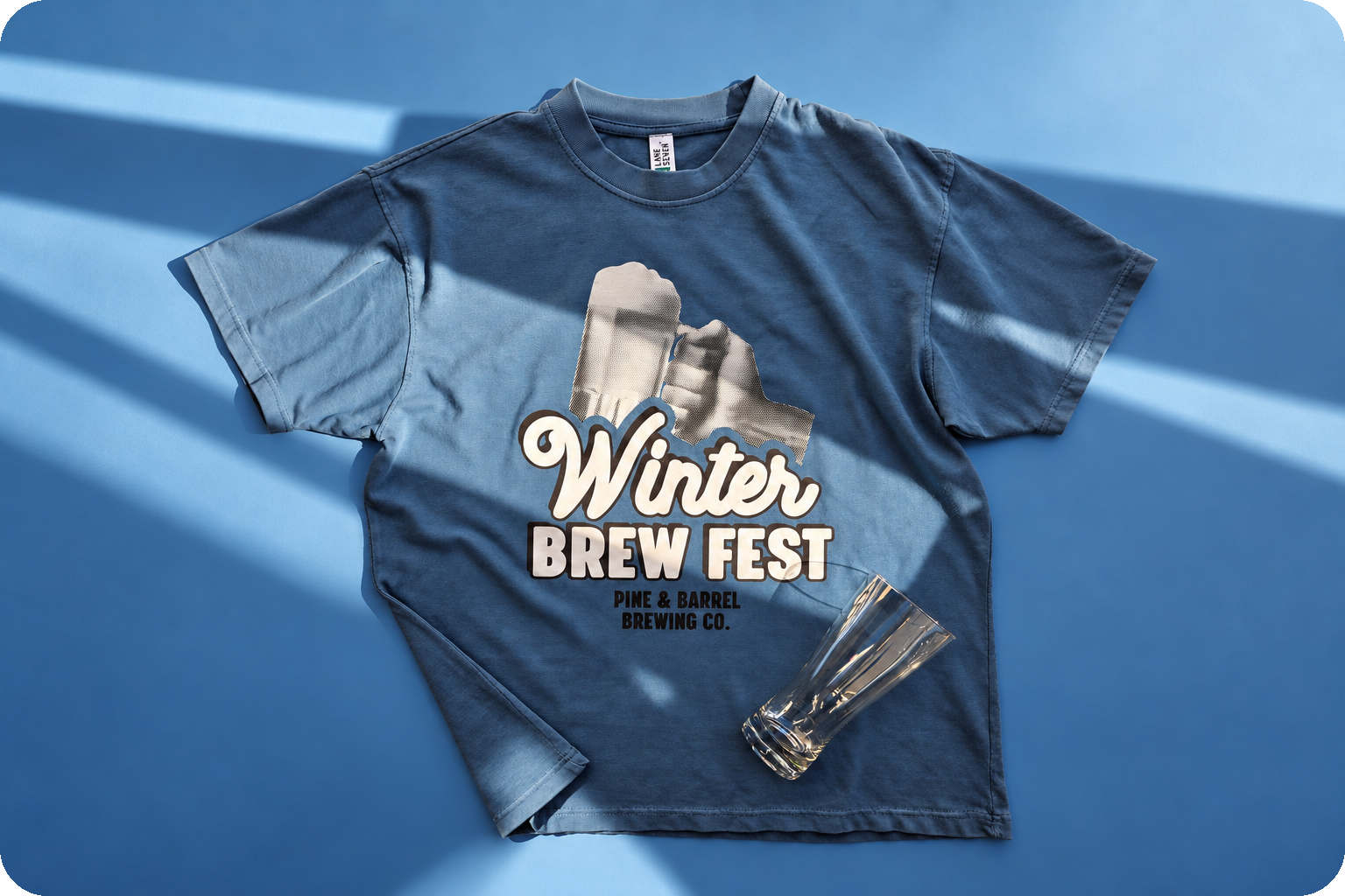
The Winter Brew Fest design is a good example. Printed with two colors of Howard Multi-Purpose, it uses black and white halftones to create tonal variation and depth. The result has the character of a vintage event poster without requiring additional ink colors.
Halftones work by breaking areas of shading into patterns of small dots. By varying their size and spacing, designers can suggest gradients, texture, and dimension while maintaining a controlled color palette.
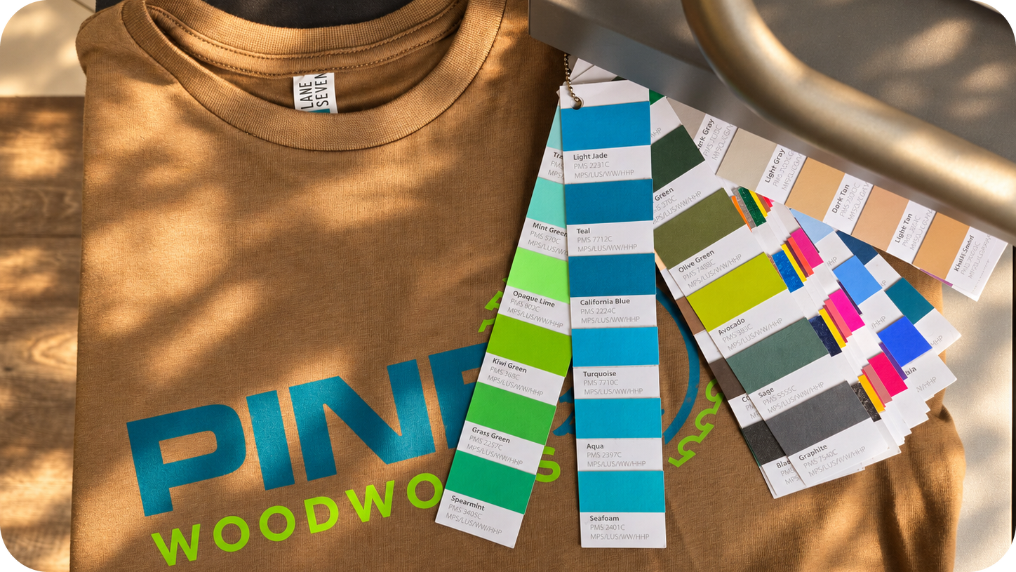
Pine Woodworks takes a different approach with the same two-color technique. Rather than relying on tonal variation, its composition uses bold typography and graphic elements to establish a strong visual hierarchy.
Both designs demonstrate that the number of ink colors is only one part of the creative equation. How those colors are used matters just as much.
Use Specialty Finishes With Intention
Specialty heat transfers introduce another dimension to apparel design. But the most effective applications start with a clear creative purpose.
For Slope Squad Reunion, white Puff adds raised texture to the graphic, giving the design a tactile quality that flat ink wouldn't achieve. The effect becomes part of the visual identity rather than an embellishment added afterward.
Shimmer offers a different kind of impact. In Holly Jolly Christmas, a subtle metallic-like sheen adds interest to the holiday artwork without competing with its colorful composition.
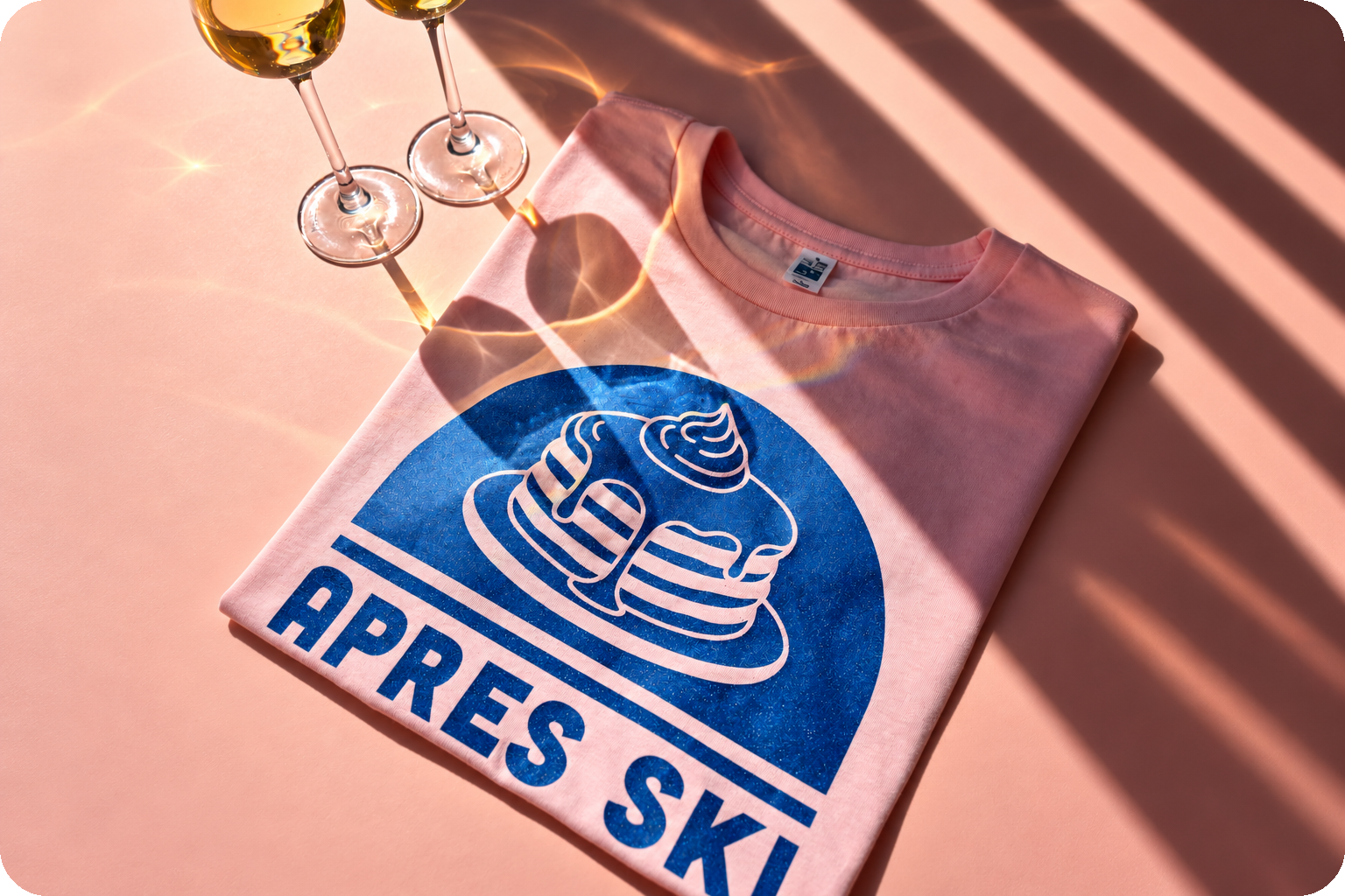
In Après Ski Brunch Club, Blue Shimmer takes on a more prominent role, helping establish a playful, polished aesthetic.
The distinction is intentional. A specialty finish can be a small accent or a defining feature, depending on the design.
Vintage Wash approaches print character from another direction. Its semi-transparent ink allows the garment color to influence the final appearance, creating a softer, lived-in effect.
That relationship is especially important in Christmas Classic Basketball Tournament, where the three-color Vintage Wash design works with the Pigment Black garment to create a retro athletic look.
These techniques aren't interchangeable. Puff introduces dimension, Shimmer contributes sheen, and Vintage Wash allows the garment itself to participate in the visual result.
Choosing between them is as much a design decision as a production consideration.
Know When Full Color Is the Better Creative Choice
Not every design benefits from a limited palette.
Detailed illustrations, gradients, and complex color relationships sometimes call for a printing method that preserves the artwork rather than simplifying it.
Winter Solstice demonstrates that approach with an oversized illustration produced using colorVIBE DTF. Full-color printing allows the artwork's details and tonal transitions to remain intact.
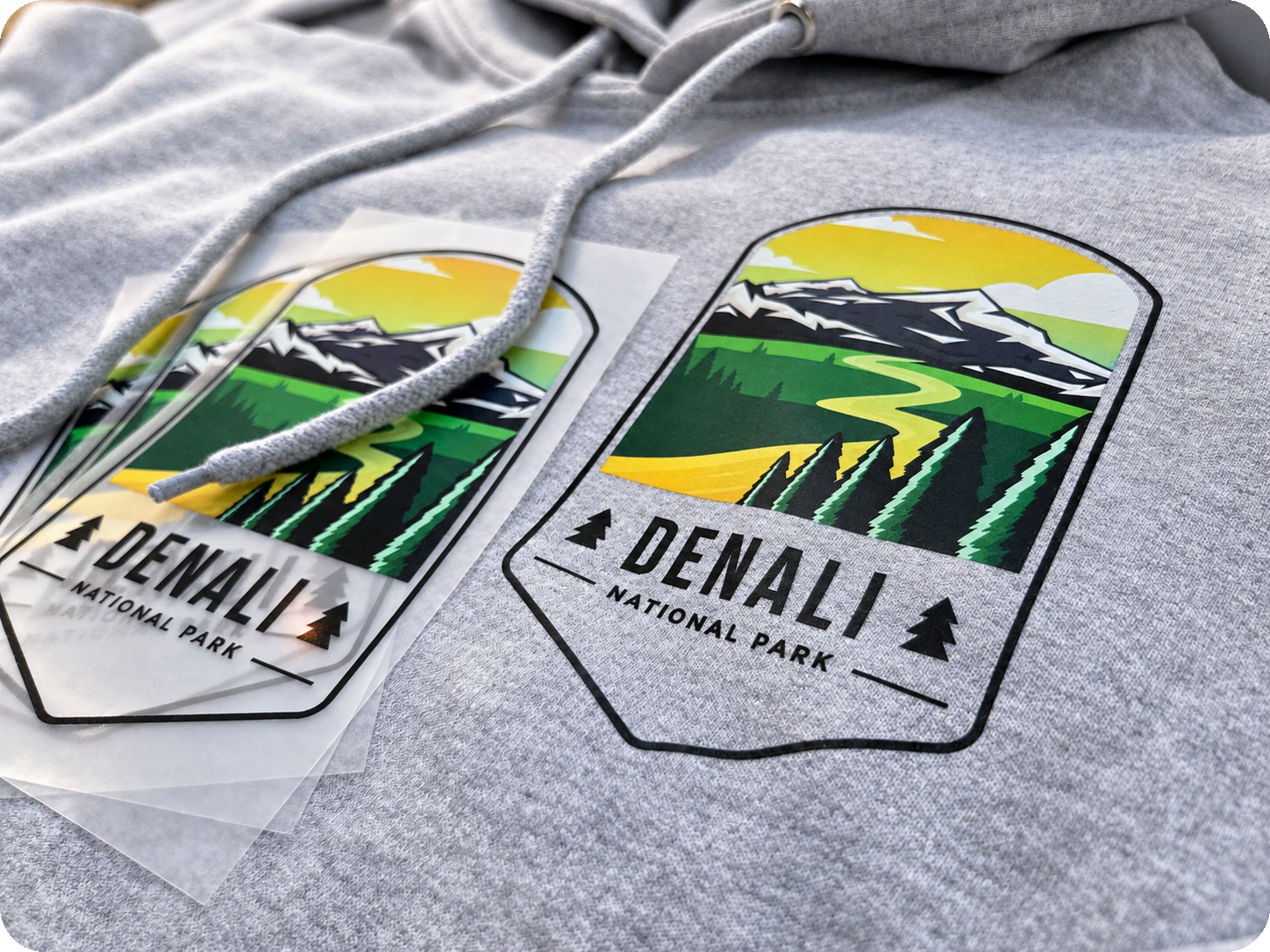
Denali National Park uses colorVIBE Hybrid to achieve a similarly detailed, full-color result through a different transfer construction.
Both techniques give decorators creative flexibility when artwork calls for more than a few spot colors.
The important distinction is that full color isn't automatically the better choice. A bold two-color design can be just as compelling as a detailed illustration.
The goal is to select the technique that supports the artwork's intended character.
Match the Creative Goal to the Printing Technique
Different heat transfer techniques offer different creative advantages. Here's a quick reference for choosing an approach based on the artwork.
The right choice also depends on the garment and application requirements, so material compatibility still matters.
Think Beyond the Graphic
The most interesting apparel designs often come from considering artwork, printing technique, and garment selection together.
A halftone can change how a limited palette feels. A specialty finish can introduce a new visual dimension. A semi-transparent ink can make garment color part of the design itself.
The printing method doesn't simply reproduce the artwork. It can help define its character.
Explore all eight looks in The Holiday Merch Edit to see how different heat transfer techniques and Lane Seven garments come together in finished apparel concepts.