
How to Design Summer T-Shirts That Actually Sell
Part of The Summer Merch Playbook series. Helping apparel decorators create seasonally relevant, retail-ready merch for the summer selling season.
Summer changes everything. How people dress, how they shop, and what they actually wear. Designing merch that sells in this season means making smarter decisions across color, fabric, print, and placement. This guide breaks down exactly how to do it.
The examples behind this guide come from real summer merch looks built across tees, hats, and carry goods, showing how these principles work in practice.
Best Colors for Summer T-Shirts
Color is one of the strongest drivers of summer purchasing decisions.
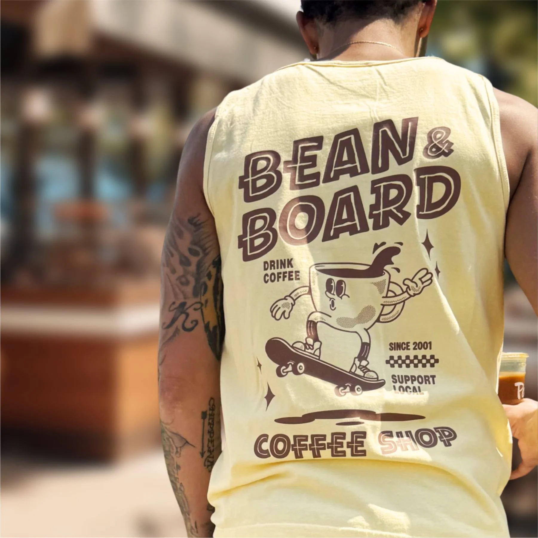
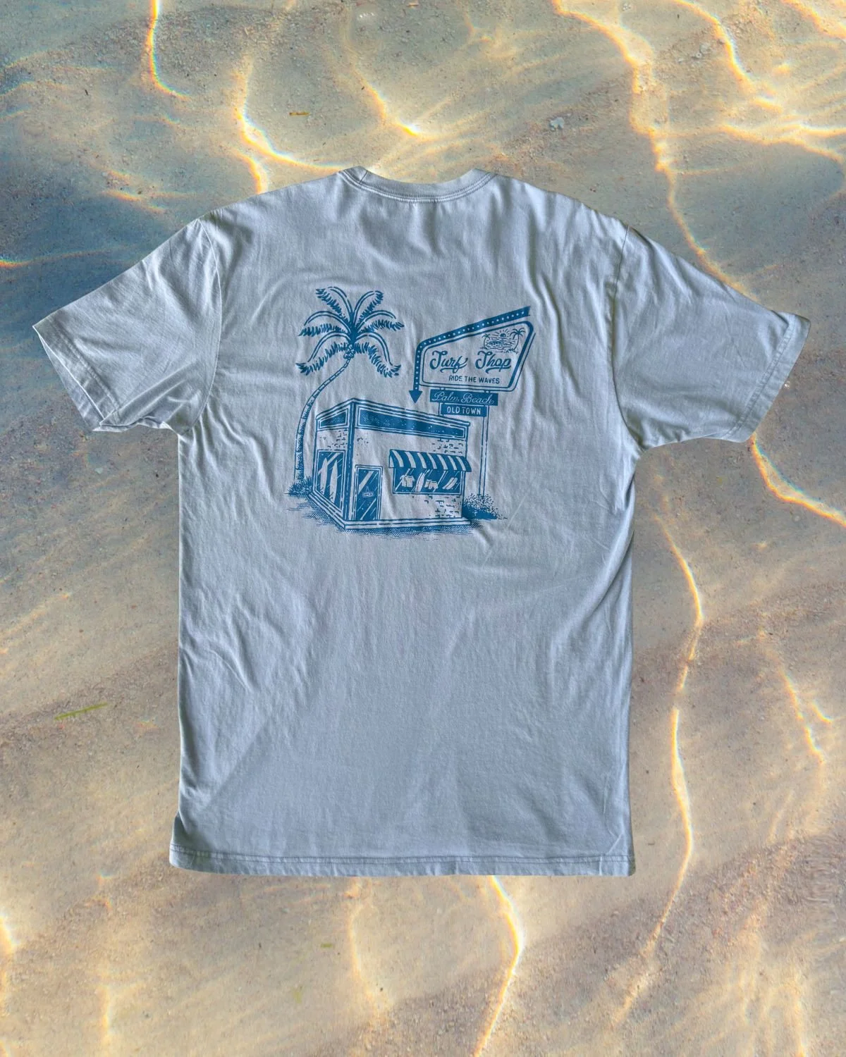
In bright outdoor light, highly saturated colors often feel harsh or overwhelming. Instead, summer merch performs best with softer, sun-faded tones that feel natural in daylight.
Strong summer color directions:
• Warm white, cream, and bone
• Sand and soft khaki tones
• Washed black instead of solid black
• Dusty blues and faded teals
• Sage green and muted olive
• Soft coral and terracotta accents
• Controlled pops of aqua or golden yellow
These tones reflect how color naturally appears under sunlight rather than studio lighting. They also photograph better in real outdoor environments, which matters for social selling and product presentation.
This approach aligns with a sun-faded summer palette, where colors feel slightly worn in instead of overly bright or artificial.
Best Fabrics and Garments for Hot Weather
Fabric choice plays a major role in how wearable summer merch feels.
In warmer months, people naturally choose garments that feel lighter, softer, and more breathable.
High performing summer garments include:
• Ring spun cotton tees for softness and airflow
• Garment dyed tees for a broken in, lived in feel
• Lightweight cotton blends for durability without heaviness
• Tanks and cropped silhouettes for heat heavy environments
Beyond fabric, garment type also matters. Summer buyers lean toward pieces that match their daily activity:
• Relaxed tees for everyday wear
• Tanks for outdoor activity or fitness
• Hats for sun protection
• Bags and totes for travel and events
Summer apparel is as much about function as it is about design.
Print Styles That Feel Better in Heat
Print style has a direct impact on how heavy or breathable a garment feels. Summer-friendly print approaches focus on reducing visual weight and improving comfort perception.
Vintage Wash Transfers
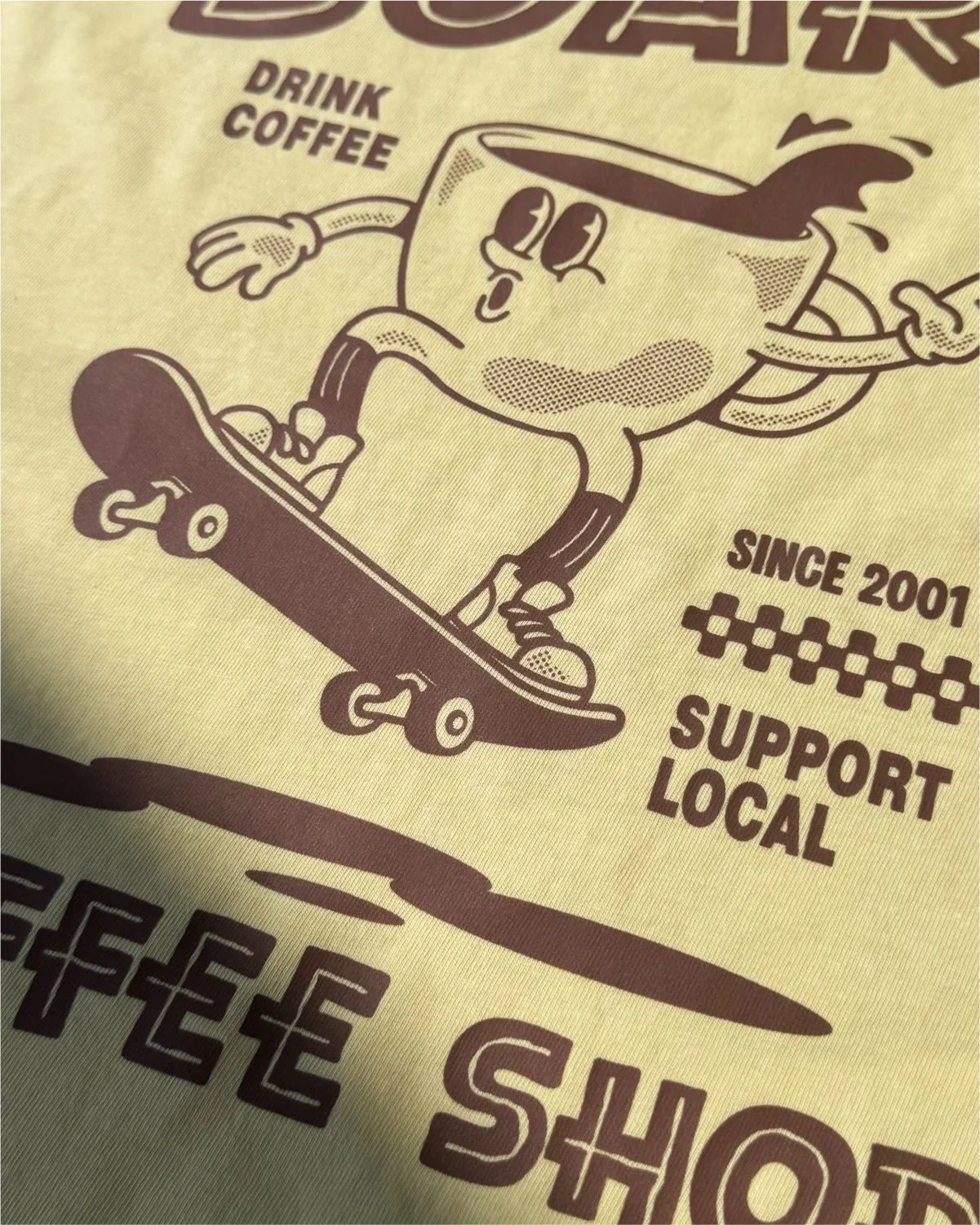
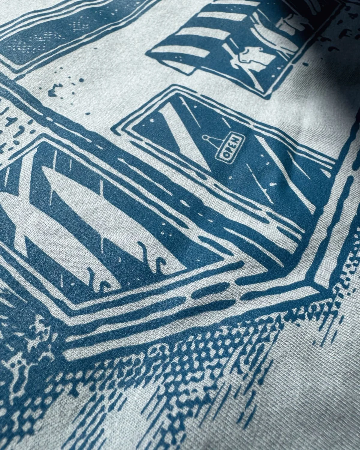
Vintage Wash effects create a naturally softened, slightly worn print appearance. This breaks up solid ink areas and makes larger graphics feel lighter and more breathable on the garment.
Puff Ink
Puff adds dimensional texture without relying on heavy ink coverage. It works especially well for simple shapes and bold statements.
Clear and Tonal Effects
Clear, gloss, or tonal ink systems add subtle depth without increasing visual weight. These finishes help keep designs minimal while still feeling intentional.
Open Space Design Structures
Designs that include negative space or broken-up elements allow more of the garment to show through, which visually reduces heaviness and improves summer wearability.
The goal is not more ink. It is smarter ink distribution.
For more design tips, read Designing for Specialty Screen Print Transfers.
Placement Trends for Summer Merch
Here is the placement insight most people get wrong: oversized prints are not automatically heavy. When the artwork is simplified and the composition is open, a large placement can actually feel lighter than a small, dense graphic. It distributes visual weight differently across the garment. That principle should drive every placement decision in summer merch.
Because summer apparel is worn more casually and often in outdoor environments, placement decisions need to support comfort, readability, and overall balance rather than compete with the garment.
Effective summer placement approaches:
• Oversized back prints with simplified composition and open space
• Large scale front or back graphics that use breathing room instead of dense fills
• Left chest or minimal front hits paired with stronger secondary placement
• Split front and back storytelling layouts that create movement across the garment
• Off-center or vertical placements that feel more relaxed and less rigid
What matters most is not placement style. It is how much visual weight the design carries and how it interacts with a lightweight summer garment in real wear conditions.
Mistakes to Avoid in Summer Merch Design
Most underperforming summer merch fails for predictable reasons.
Overcomplicated Artwork
Too many elements reduce readability outdoors and limit wearability. Simpler, bolder graphics hold up better in sunlight and real-world wear.
Heavy Ink Coverage
Solid, full-coverage prints can feel visually and physically heavy on lightweight garments. In summer especially, customers can tell the difference between a garment that breathes and one that does not.
Ignoring Garment Selection
Strong designs fail when paired with the wrong fabric or silhouette for summer use. The garment is part of the design decision.
No Cohesion Between Pieces
Disconnected designs do not perform as well as coordinated collections. Summer buyers often purchase more than one item — give them a reason to.
Designing for Screens Instead of Real Wear
What looks sharp on a monitor can fall flat in sunlight, movement, or casual styling. Always pressure test designs in real outdoor conditions before committing.
Ignoring Seasonal Context
Summer merch is worn outdoors, photographed more often, and seen in motion. It must be designed for that environment.
The Summer Merch Mindset
Great summer merch is not about trends. It is about understanding how people dress, move, and shop in warm weather. When color, fabric, print style, and placement work together, the result feels effortless, wearable, and intentional.
That is what makes merch sell.
This article pairs with The Summer Merch Lookbook, where you can see these principles applied across real products, verticals, and complete merch sets.
Frequently asked Questions About Designing Summer T-Shirts
What colors work best for summer t-shirts?
Muted, sun-faded tones like bone, sand, sage, dusty blues, washed black, and soft terracotta perform best because they feel natural in sunlight and photograph well outdoors.
What fabric is best for hot weather shirts?
Lightweight ring spun cotton and garment dyed tees work best because they are soft, breathable, and comfortable in heat.
Are oversized prints good for summer merch?
Yes, when they are designed with simple structure and open space. Oversized does not mean heavy. It depends on visual density.
What print styles work best in summer?
Vintage wash, puff ink, tonal prints, and open-space designs work best because they reduce visual weight and improve breathability.
What are common mistakes in summer merch design?
Overly complex artwork, heavy ink coverage, ignoring garment choice, and designing without considering real outdoor wear.