
From Boring to Buyable: 10 Design Tips to Instantly Elevate Your Custom Apparel
TL;DR Short on time? Here’s the cheat sheet for taking your apparel designs from basic to buyable:
Think Garment First: Match your design to the shirt’s color, cut, and vibe.
Create a Focal Point: Make one element the hero. Guide the eye with contrast.
Limit Your Colors: 2–4 strong, cohesive colors beat a chaotic rainbow.
Let It Breathe: White space = premium feel. Don’t overcrowd.
Nail the Placement: Know your zones. Avoid “too low” or “off-center” mishaps.
Add Texture or Effects: Puff, shimmer, vintage wash? Adds value and profit.
Design with Context: Who’s wearing it, where, and why? Design accordingly.
Use Typography Intentionally: Fonts should match the tone and layout with purpose.
Show It Off Right: Mock it up on a real garment to sell the look, not just the art.
Simplify to Amplify: Edit down. Remove the fluff. Let your core message shine.
When it comes to selling custom t-shirts, hoodies, or team gear, great design does more than just look good - it sells.
Whether you're printing for a local event, launching your own merch line, or decorating on behalf of clients, the design itself can be the difference between something that gets worn once and something that becomes a wardrobe favorite.
So how do you take a design from "meh" to must-have? Here are 10 design tips to instantly elevate your custom apparel and turn browsers into buyers.
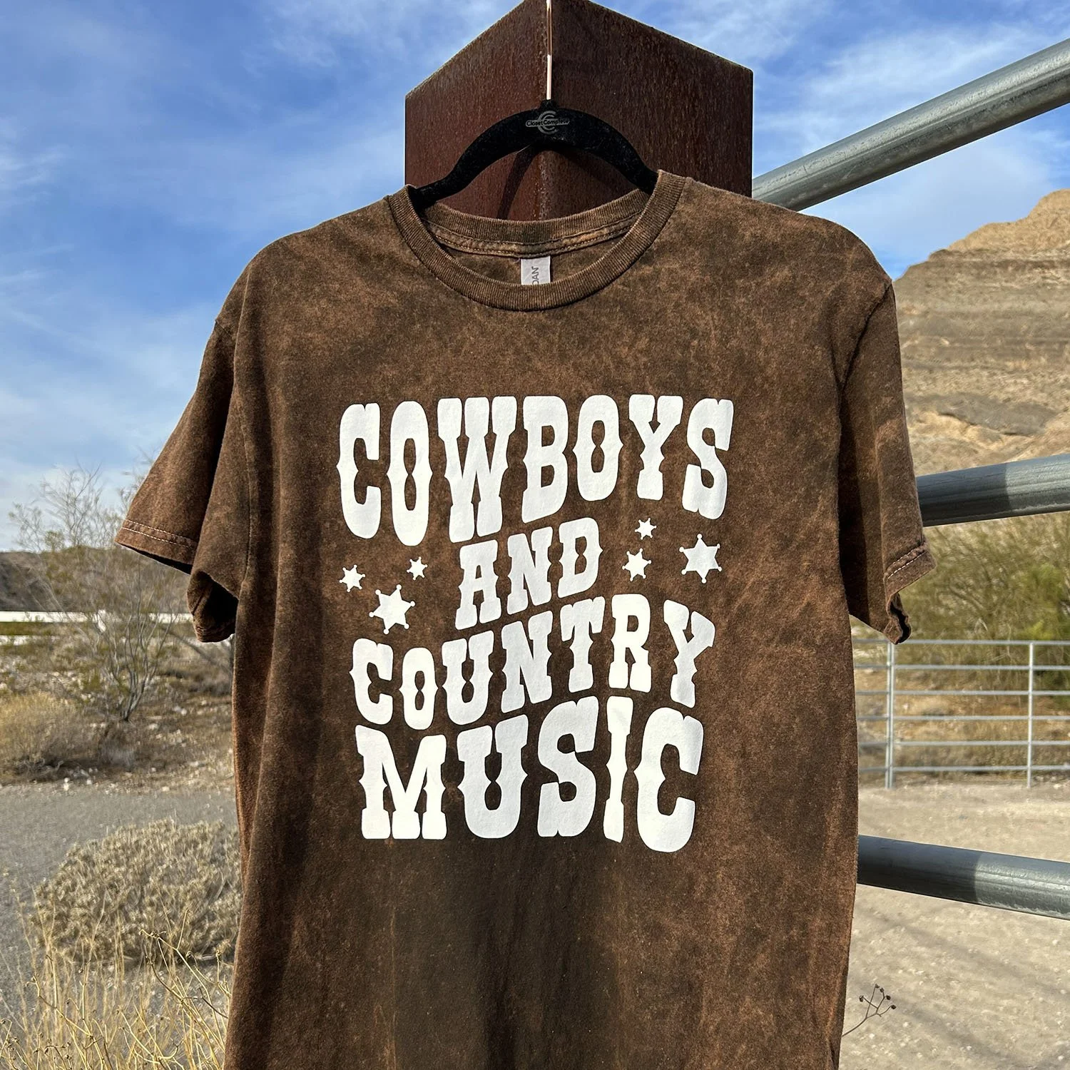
1. Design with the Garment in Mind
Think about how your design will interact with the shirt or hoodie it's printed on. Light colors pop on dark garments. Bold graphics may overpower a fitted crop top but shine on an oversized tee. If you're printing on a heathered fabric, softer tones or vintage-style artwork can complement the texture beautifully.
💡 Pro Tip: Always ask yourself, "Would I wear this on this garment?"
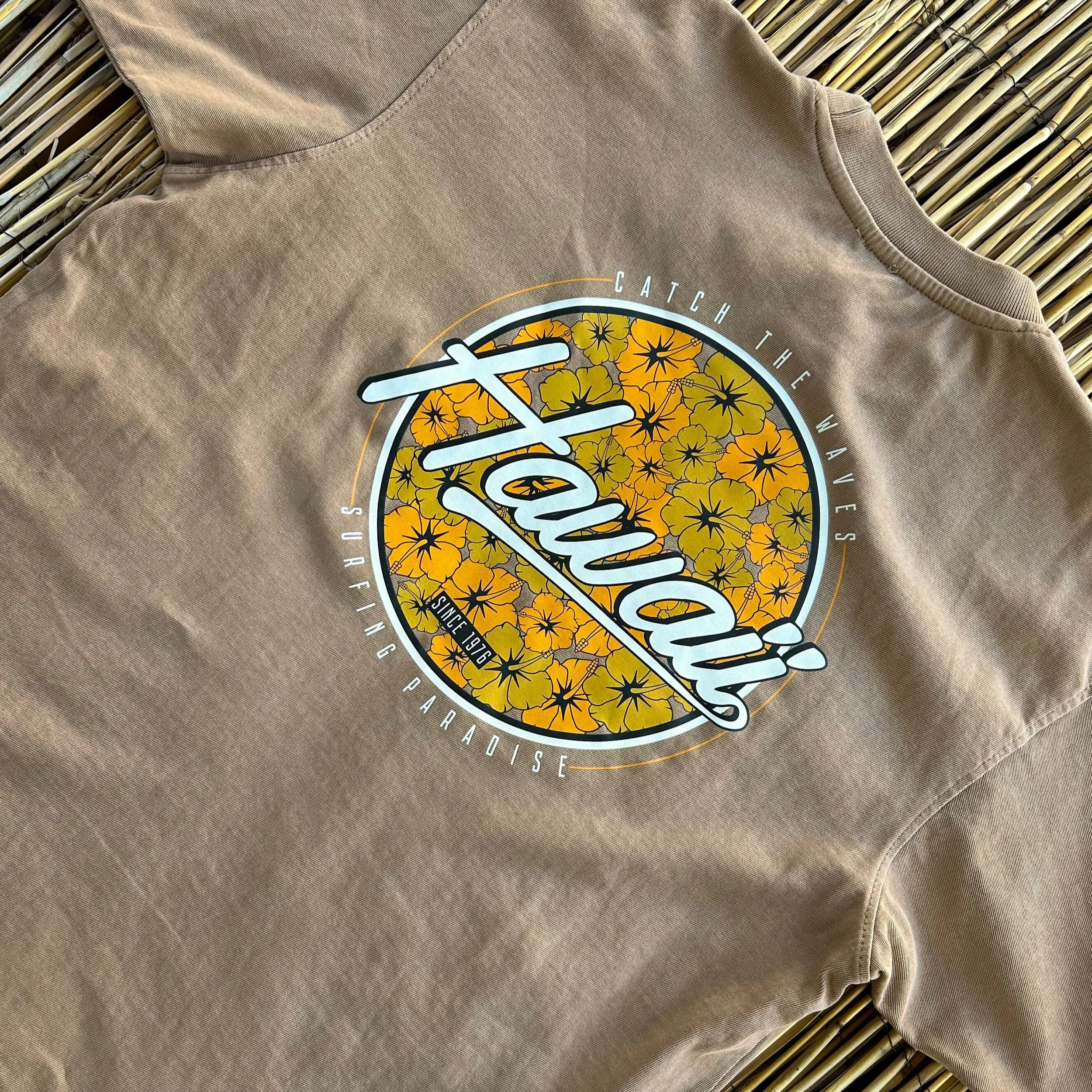
Bold graphics and colorVIBE Hybrid complement the oversized fit of this Lane Seven heavyweight tee.

Vintage-style artwork with a Vintage Wash application pairs well with this Comfort Colors garment dyed crewneck.
2. Use Smart Focal Points
The eye loves order. A clean focal point helps the viewer quickly understand what your design is all about.
Create a visual hierarchy:
➤ Lead with a bold graphic or wordmark
➤ Use size, contrast, and color to guide the eye
➤ Let supporting elements (like subtext or embellishments) stay secondary
The goal? Make your message unmistakable, even from across the room.
3. Limit Your Color Palette
Too many colors can create visual chaos and drive up your print costs. The sweet spot? Stick to 2–4 thoughtfully chosen colors that play well together.
Try one of these formulas:
➤ A bold primary + neutral accents
➤ All tonal shades for a boutique vibe
➤ Add a specialty ink (like shimmer or glow) as a design enhancer, not just an extra color
Keeping it tight makes your design feel intentional and high-end.
4. Let Your Design Breathe
White space is your friend. It's what separates a clean, confident design from one that looks cluttered or crammed.
When laying out artwork:
➤ Don’t try to fill every inch of the print area
➤ Leave padding around edges and between elements
➤ Use spacing to create structure and sophistication
Sometimes, what you leave out is what makes it work.
Negative space elevates this sophisticated corporate logo.
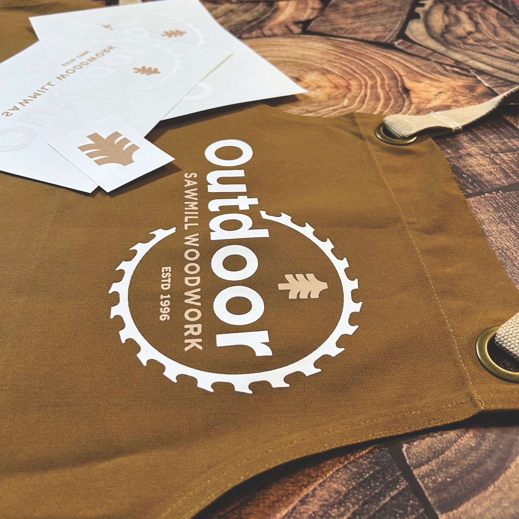
Leaving space in this design provides a clean, legible end product.
5. Master Placement
Even the best artwork can look amateur if it's placed awkwardly. And don’t be afraid to break the rules - just do it with intention.
Know your zones:
➤ Full front: centered and 3-4 fingers below the collar
➤ Oversized: higher up and closer to the collar
➤ Left chest: roughly where the collar and sleeve intersect
➤ Back prints: centered and bold or upper back for branding
6. Add Texture with Specialty Inks
Want to stand out? Specialty finishes like puff, shimmer, glitter, or vintage wash transform simple designs into scroll-stoppers.
Use them to:
➤ Highlight key elements (like outlines or shadows)
➤ Add physical dimension to flat graphics
➤ Elevate a minimal design into a boutique-worthy piece
💡 Bonus: Specialty inks increase perceived value and your profit margin.
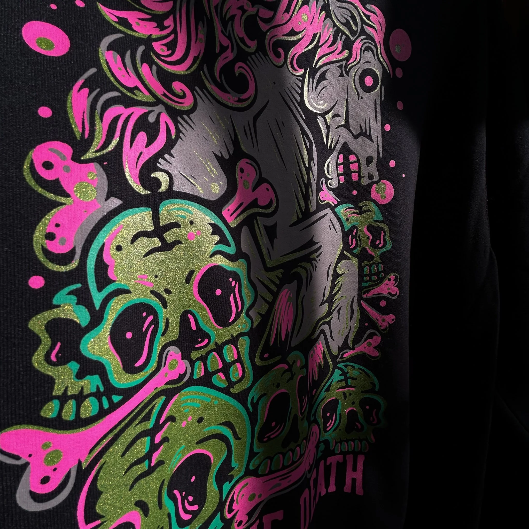
Shimmer (MP) elevates this design and highlights otherwise cluttered elements.
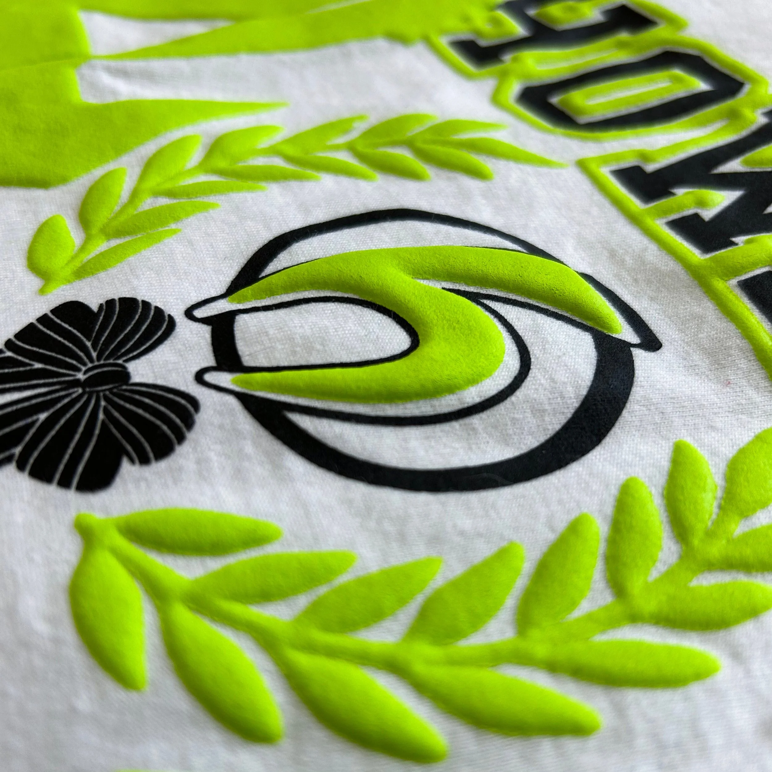
Puff literally elevates this design with dimension you can see and feel!
7. Design for Context
Who’s wearing this, and where?
Think about the design in the real world:
➤ A gym tee might need strong fonts and movement
➤ A bachelorette shirt should feel playful and bold
➤ A festival tee can lean edgy and expressive
Design for the vibe your customer wants to feel when they put it on.
8. Make Typography Work Harder
Type isn’t just a vehicle for words, it’s a design element in its own right.
➤ Choose fonts that match the mood (gritty, elegant, retro, bold)
➤ Keep it readable, even from a few feet away
➤ Try layouts beyond straight lines – think arches, stacks, or type as shape
Pairing fonts? Stick to no more than two and let one take the lead.

Bold typography that goes beyond straight lines matches the vibe.
Using fonts that match the mood instantly elevate your design.
9. Show It Off (the Right Way)
A flat vector preview rarely sells a design. A great mockup? Game-changer.
Use lifestyle mockups or garment photos to:
➤ Show scale and placement
➤ Convey mood or intended audience
➤ Make your artwork feel real and wearable
Even better - if you can, print a sample and photograph it. Real always wins.
10. Simplify to Amplify
After finishing a design, take a step back and ask:
➤ Is there one thing too many?
➤ Can I remove something to make the rest stronger?
Great design isn’t about doing more; it’s about doing just enough to make the message land.
Resources & Inspiration
Download: Custom Apparel Design Checklist
Recommended Read: A Tribute to T-Shirt Art – A personal reflection by Jody Mazade, Sales & Marketing Director at Howard Custom Transfers, on the artistry behind intentional t-shirt design and the legacy of craftmanship in our industry.
Dig Deeper: Suggested Sizing & Spot-On Placement – Practical advice for best-practice and perfect applications.
Final Thought
Design doesn’t have to be complicated to be compelling. It must be intentional.
By thinking like a shopper and not a printer, you’ll naturally make choices that elevate your work and help your apparel sell itself.
Want help turning your designs into top-selling gear? We’re here for it. From screen print transfers to specialty finishes, we’ll help you bring your vision to life with pro-level quality that’s anything but boring.