
Team Shop Reboot Case Studies
Fall sports season has a way of sneaking up. Coaches are finalizing rosters, boosters are asking what the store looks like this year, and somewhere in the middle of it, a decorator has to walk into a meeting with more than samples and a price sheet. They have to walk in with a plan.
That's what the four collections in this series were built to demonstrate. Each one solves a different problem a decorator runs into while planning a school's fall apparel program, and each one runs through the same three schools, Brighton, Marshfield, and Houghtown, so the comparison stays consistent from collection to collection. Heritage design. Performance fabric. Retail-ready finishes. Drop-day urgency. Four different disciplines, each with its own logic for garment selection, transfer strategy, and pricing.
Use these as a framework heading into the season. The sequencing, the pricing structure, and the way each piece earns its place on the rack all carry over directly to the account being built right now.
Case Study 01: Legacy Athletic
Building a Heritage-Inspired School Collection
The Objective
Heritage design has one job: make the gear look like it's always belonged to the program, not something put together for a fundraiser. That's the standard Legacy Athletic sets, and it's a good one to hold yourself to on any heritage account.
The Inspiration
The reference point was the varsity letterman era: bold mascot marks, block lettering, garments built heavyweight enough to actually hold up to a season of wear. Nothing about that era relied on complexity. A strong mark on a heavyweight tee carried the design on its own, and that's still true decades later. The temptation with a heritage collection is to add more, another color, another effect, another line of type. Legacy Athletic goes the other direction on purpose, and the restraint is what makes it feel authentic rather than manufactured.
Building the Color Palette
| School | Color Palette | Why It Works |
|---|---|---|
| Brighton | Dark maroon, bright red, light tan | High-contrast combination built around their badger mascot |
| Marshfield | Athletic gold, dark green, white | Keeps their hornet mark sharp against heavyweight fleece |
| Houghtown | Bright royal, bright navy, pastel blue | Cooler, more restrained palette behind their hawk crest |
Garment Selection
| School | Garment | Fabric & Notes |
|---|---|---|
| Brighton | Port & Co. Heavyweight Tee - 9479 | 50/50 cotton/polyester. Entry piece. |
| Marshfield | Gildan Heavyweight Hoodie - 115 | 8-ounce, 50/50 cotton/poly. Everyday staple. |
| Houghtown | Sport-Tek Quarter-Zip - 68581 | 8.8-ounce, 56/44 cotton/polyester spacer knit. Premium sideline piece. |
Transfer Strategy
| School | Transfer Method | Why It Was Chosen |
|---|---|---|
| Brighton | Howard Hot Peel | Straightforward and durable, well-suited to a bold single mascot mark on heavyweight cotton |
| Marshfield | Howard Multi-Purpose | Handles detailed crest work and holds up cleanly on heavier fleece |
| Houghtown | Howard Multi-Purpose | Handles detailed crest work and holds up cleanly on heavier fleece |
The Finished Collection
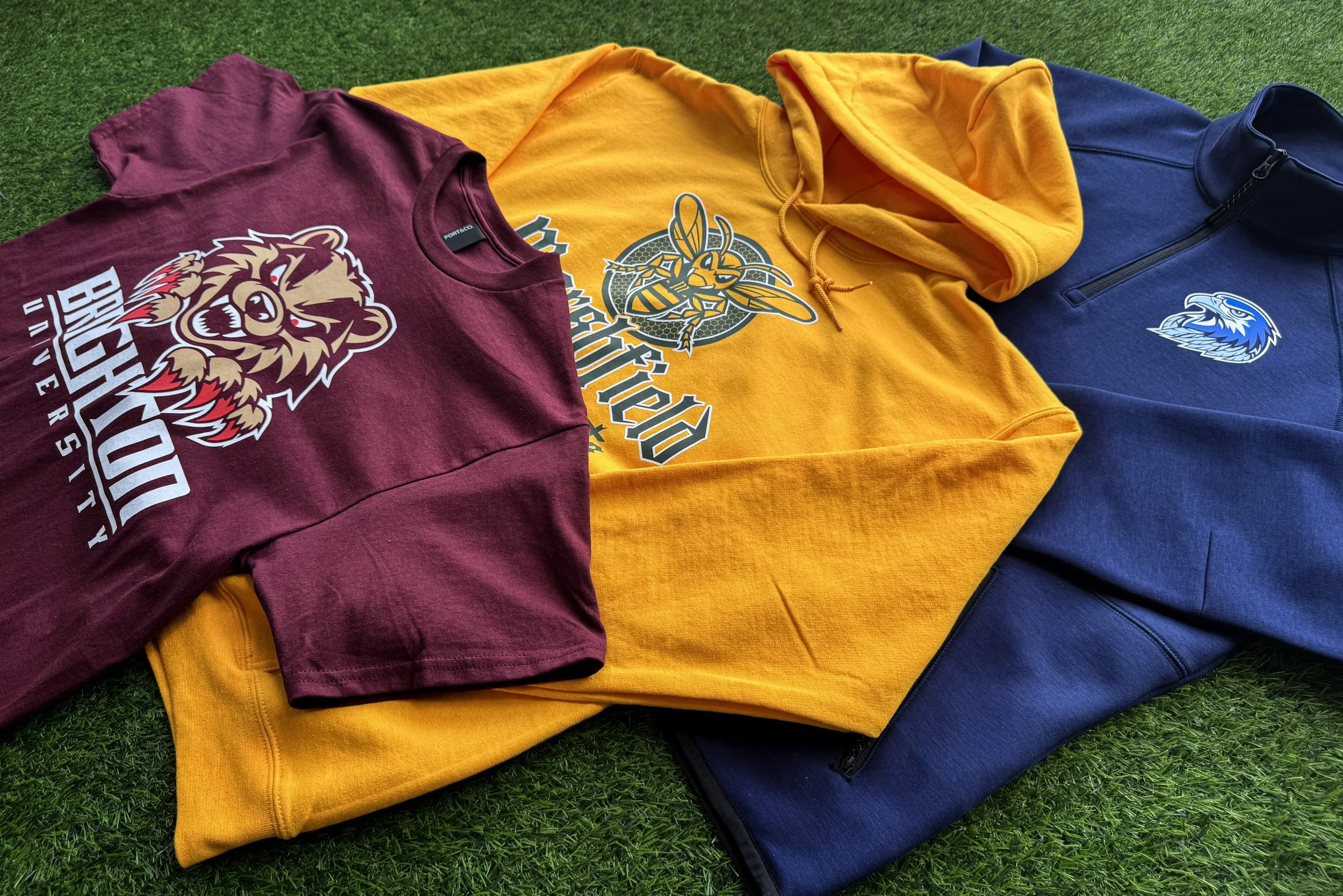
Nothing in Legacy Athletic needed a specialty finish to feel premium. The discipline of a locked palette and a confident mascot mark did that on its own, and that's the collection's real lesson: restraint is a design decision, not a shortcut.
Takeaways for Decorators
Strong mascot
Tight palette
Match transfer to garment
Premium doesn’t require complexity
Case Study 02: Modern Performance
Creating a Performance Collection Built for Today's Athlete
The Objective
If Legacy Athletic is about restraint, Modern Performance is about proving a school doesn't have to choose between fabric that performs and a graphic that impresses. That tradeoff used to be real. It isn't anymore, and this collection exists to make that case to any athletic department still deciding between the two.
Designing for Speed and Movement
The design direction leaned into motion: angled type, dynamic mascot poses, sport-specific graphics instead of one generic mark reused across every team. Brighton's football hoodie used a full mascot graphic built for impact. Marshfield's design was built specifically for volleyball, not athletics in general, which matters more than it sounds like it should. A volleyball program that gets a football-shaped design knows immediately that nobody thought about them specifically. Houghtown's training piece carried a multi-placement design across sleeve, back, and front, treating the garment as three separate canvases instead of one.
Choosing Performance Garments
| School | Garment | Fabric & Notes |
|---|---|---|
| Brighton | Richardson Performance Hoodie - 74373 | 92/8 poly-spandex fleece |
| Marshfield | Richardson Long Sleeve - 73275 | 4.1-ounce, 91/9 poly-spandex pin-dot mesh, built for volleyball warmups |
| Houghtown | Richardson Training Hoodie - 73473 | 6.8-ounce, 92/8 poly-spandex performance fleece, carries graphics across three placements without adding bulk |
Transfer Strategy
| School | Transfer Method | Why It Was Chosen |
|---|---|---|
| Brighton | colorVIBE DTF | Full-color, high-detail graphics on stretch fabric without the print becoming the stiff part of the garment |
| Marshfield | colorVIBE DTF | Full-color, high-detail graphics on stretch fabric without the print becoming the stiff part of the garment |
| Houghtown | Howard Multi-Purpose | Applied across three placements, holds up through daily practice across multiple print locations |
The Finished Collection
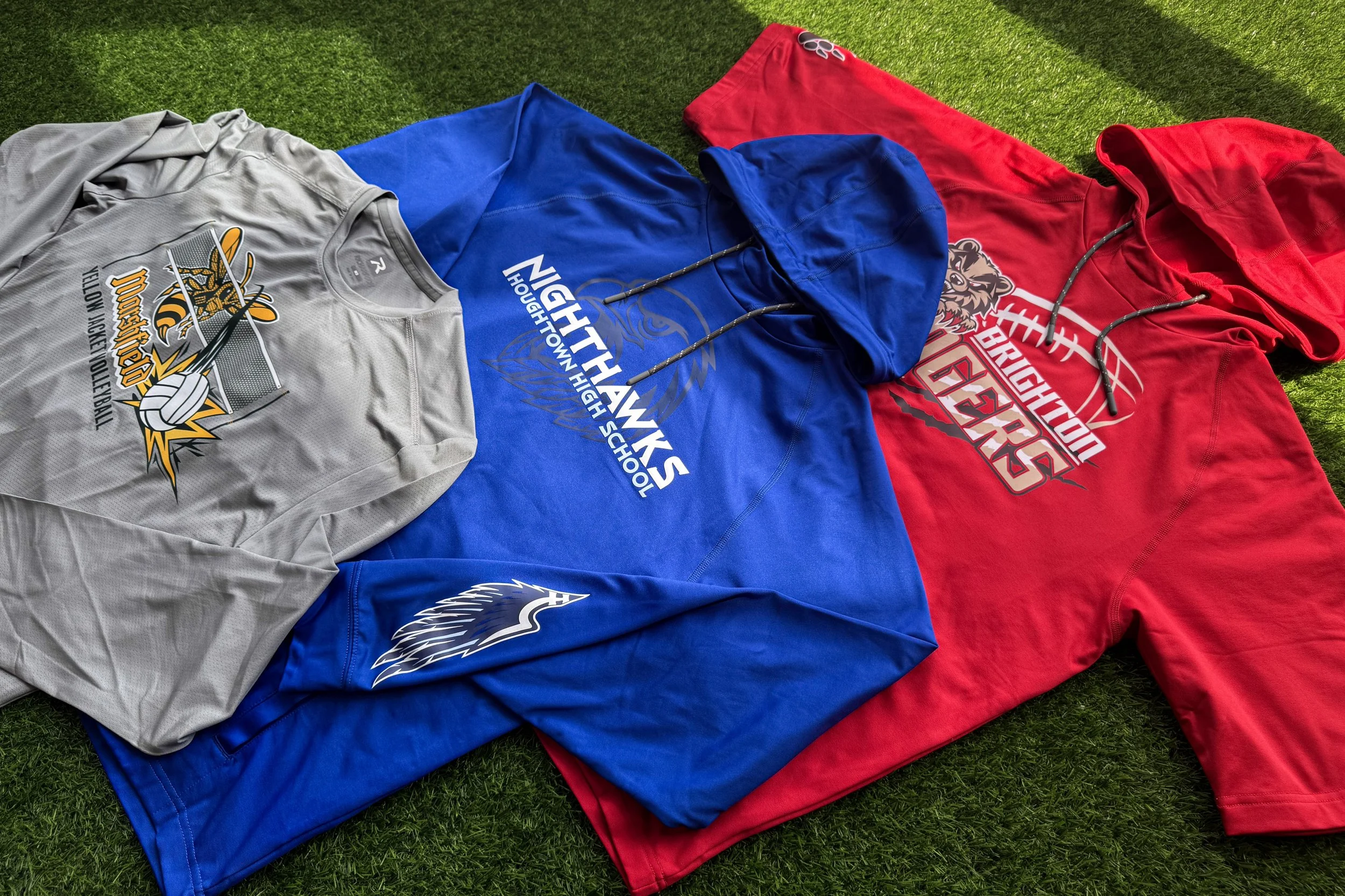
A football hoodie, a volleyball long sleeve, and a training hoodie. Three different sports, three different garments, two transfer techniques, no reused templates, and no team left wondering why their gear looks like someone else's.
Takeaways for Decorators
Sport-specific beats generic
DTF opens performance-fabric bids
Multi-placement adds billable space
Quote as one package
Case Study 03: Student Lifestyle
Designing Spirit Wear Students Want to Wear Beyond School
The Objective
Student Lifestyle asks a simple question: would a student choose to wear this on a Saturday, with no game to go to? The direction was casual, trend-driven, campus, built to compete with what's already in a student's closet rather than with the fundraiser bin. It's the hardest bar of the four collections to clear, and the most valuable one when it works.
Finding the Retail Inspiration
The reference point wasn't other school stores. It was the retail racks students already shop. Garment-dyed tees, vintage-washed crewnecks, oversized silhouettes, the kind of pieces that could sit in a retail store without a school name attached and still sell. That's the test worth applying to every design in this collection: strip the mascot off and ask if it would still hold up on the rack.
Creating a Lifestyle Collection
| School | Garment | Fabric & Notes |
|---|---|---|
| Brighton | Next Level Cotton Tee - 7610 | 6.8-ounce, 100% combed ring-spun cotton. Soft and understated. |
| Marshfield | Independent Trading Co. Crewneck - SS3000 | 8.5-ounce, 80/20 cotton/poly fleece. Feels broken in from the first wear. |
| Houghtown | M&O Cotton Tee - 4800 | 50/50 cotton/polyester. Front mark, wingspan graphic saved for the back. |
Transfer Strategy
| School | Transfer Method | Why It Was Chosen |
|---|---|---|
| Brighton | Multi-Purpose + Puff | Adds dimension to a simple script logo |
| Marshfield | Vintage Wash | Instant broken-in look, no years of real wear required |
| Houghtown | Shimmer + Puff | Keeps the front minimal, saves the detail for the back graphic |
The Finished Collection
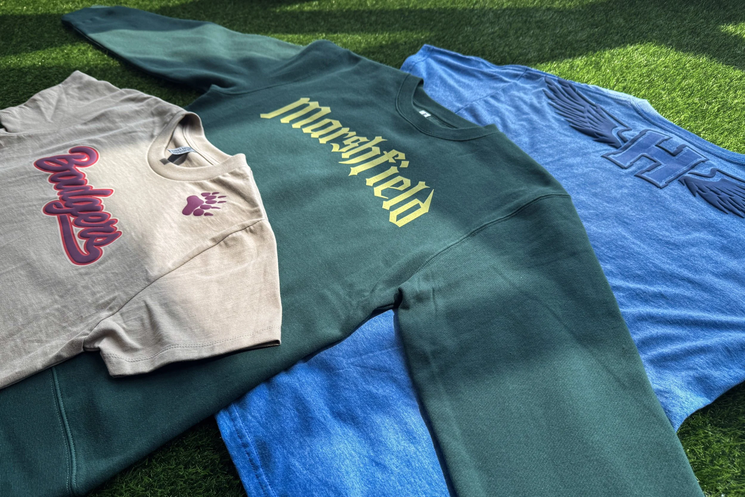
Three specialty finishes, three different textures and effects, and no piece that reads as a fundraiser shirt. This is the collection built to compete with what's already in a student's closet, and the one most likely to still be in rotation next spring.
Takeaways for Decorators
Finishes are a pricing tool
Basic blank, retail-level price
Extends the selling season
Case Study 04: Event Drop
Building a Limited-Edition Collection Around School Excitement
The Objective
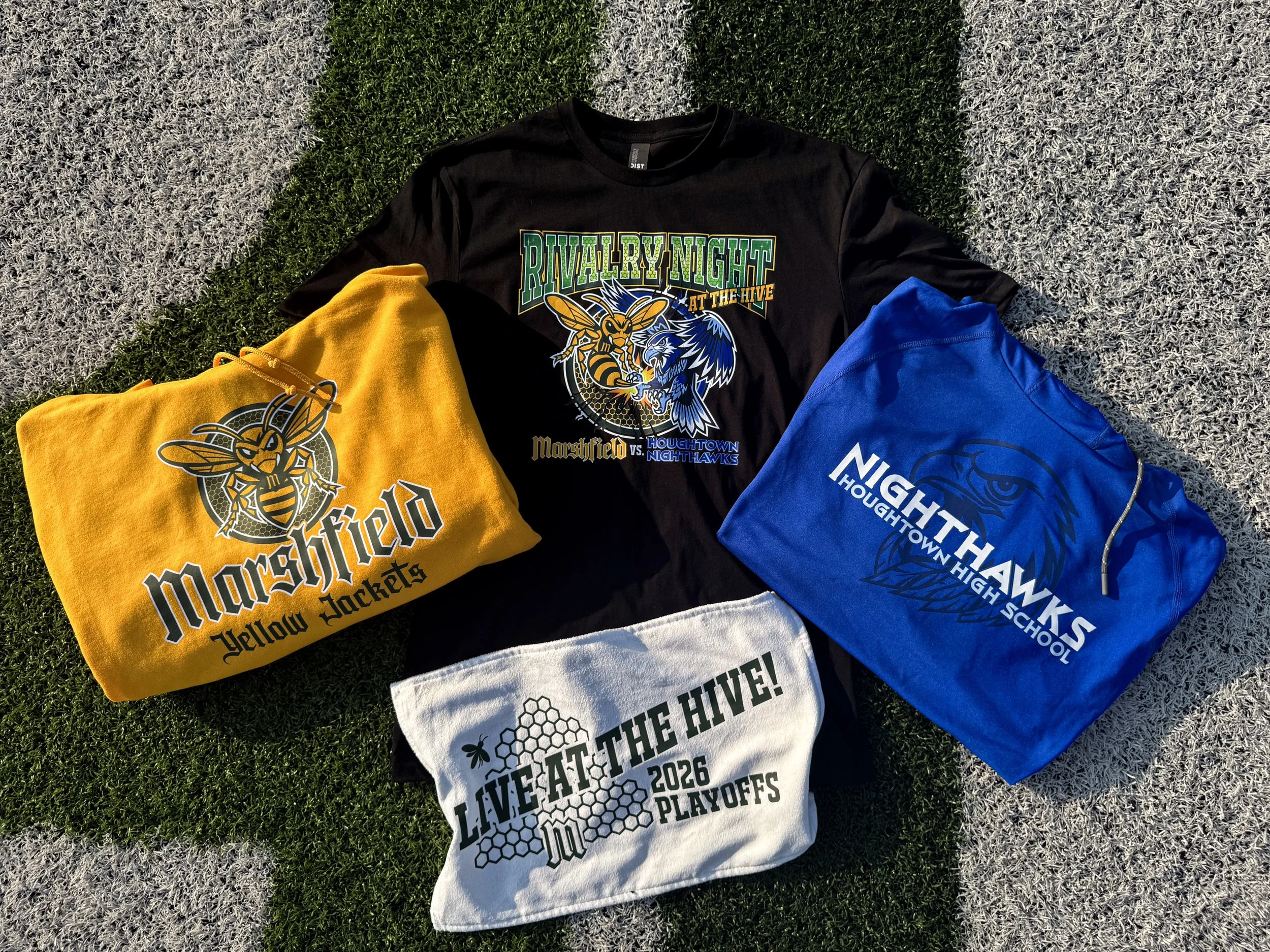
Event Drop is built around a real moment. Instead of a generic "event" concept that could apply to any school, this collection is anchored to an actual rivalry and a real playoff push, which is the model worth following any time a decorator wants a drop with built-in demand instead of one that has to be talked into existing.
Capturing the Energy of Big Moments
A Marshfield-Houghtown rivalry game. A Marshfield playoff run. A Brighton championship season. Three real moments, three pieces, each with a deadline that existed before the design did, not one invented for the sale. That's the real advantage of an event drop like this: a manufactured deadline needs marketing to convince people it's urgent. A real one already comes with the urgency built in.
Choosing Limited-Edition Pieces
| Piece | Garment | Fabric & Notes |
|---|---|---|
| "Rivalry Night at the Hive" | District Jet Black Tee - 2260 | 100% combed ring-spun cotton. Both mascots, full color. |
| "Live at the Hive! 2026 Playoffs" | Port Authority Rally Towel - 9787 | 75/25 cotton/poly velour face over absorbent terry back |
| "Clawing Our Way to the Crown" | Port & Co. Jet Black Hoodie - 75376 | 100% cotton. Illustrated crest, faux gold metallic effect. |
Transfer Strategy
| Piece | Transfer Method | Why It Was Chosen |
|---|---|---|
| Rivalry tee | colorVIBE DTF | Two-mascot, full-color composition with gradients a traditional screen print transfer couldn't easily manage |
| Rally towel | Howard Multi-Purpose | Bold and legible from the stands |
| Championship hoodie | colorVIBE Hybrid | Multi-tone detail plus the faux metallic gold effect the design called for |
The Finished Collection
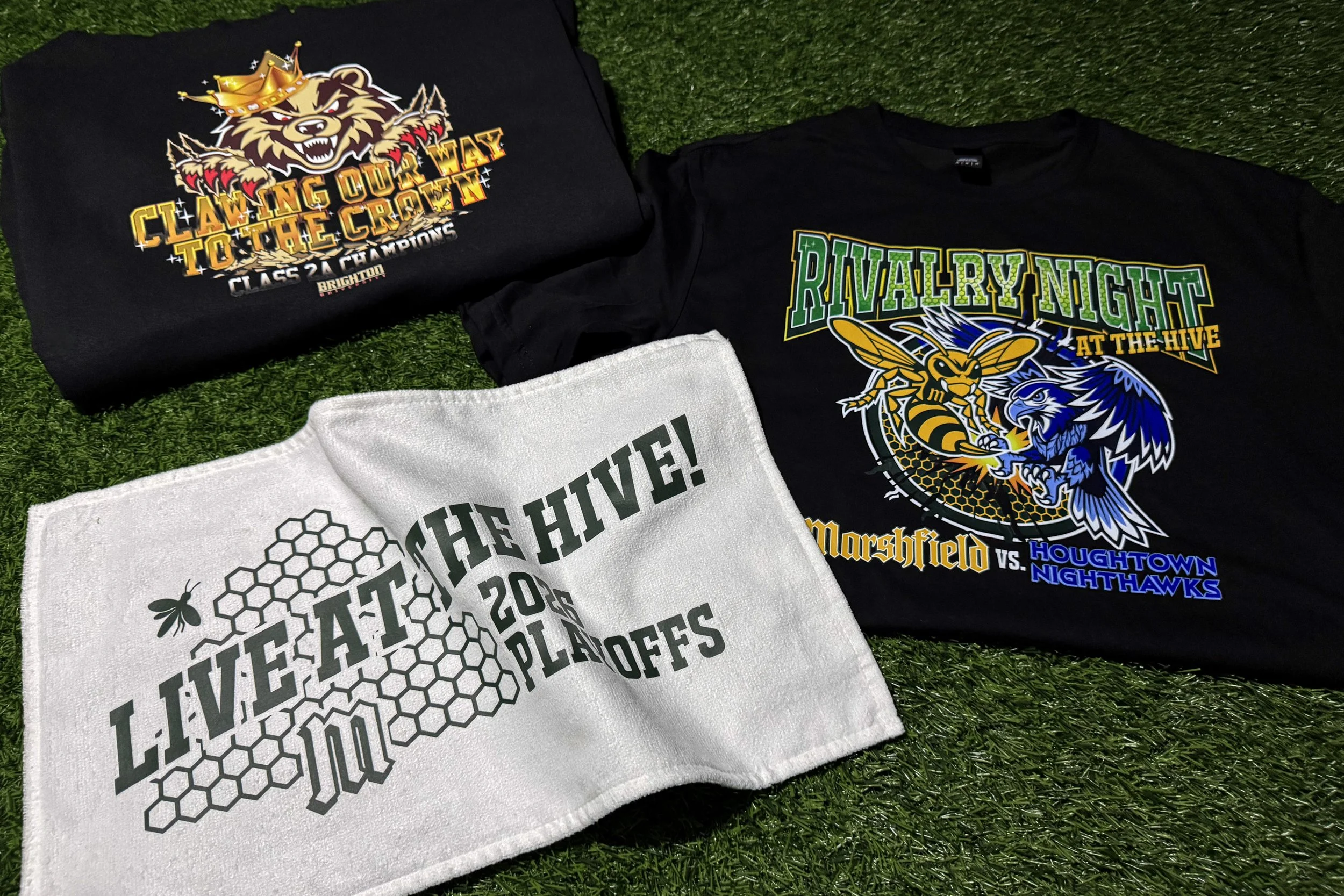
Three real moments, three techniques matched to what each design needed, and a built-in reason for urgency that didn't require inventing a deadline. By the time the championship hoodie shipped, the collection had already told the whole season's story, one piece at a time.
Takeaways for Decorators
Real deadlines, built-in urgency
Compressed window, higher conversion
Premium technique, premium price
Building the Season Ahead
Four collections, four different problems, one underlying pattern: the best school apparel programs are built with intention, not assembled from whatever's in the catalog. A locked palette. A garment tier that matches the moment. A transfer technique chosen for what it can actually do, not just what's on hand. That discipline is what turns a single order into a program a school keeps coming back for.
Fall sports season rewards decorators who show up with a plan already in place. These four collections are a starting framework, not a fixed template. The same thinking applies whether the account is a small rural program or a multi-sport district with a dozen teams to outfit.
Frequently Asked Questions
Q: How many colors should a school spirit wear design use?
A: No more than four, and ideally fewer. A tight, locked palette is part of what makes a design read as intentional rather than thrown together, and it keeps production simpler across every garment in a collection.
Q: When does a specialty finish like Puff, Vintage Wash, or Shimmer make sense?
A: Specialty finishes work best on retail-style spirit wear meant to compete with the brands already in a student's closet. Puff adds dimension to a simple logo, Vintage Wash creates an instantly broken-in look, and Shimmer adds a metallic-like detail that photographs well and gets noticed. They're less necessary on heritage or performance pieces, where the discipline of the design carries the perceived value instead.
Q: How should decorators price a multi-piece school collection?
A: Structure it in tiers: an accessible entry piece, a piece a student would actually choose to wear day to day, and one premium item carrying the most design or finish work. That range gives shoppers at every budget a reason to buy, and it gives decorators room to sequence a pitch instead of presenting one flat price.
Q: Why do real events, like a rivalry game or playoff run, outperform generic sales?
A: A real event comes with a deadline that already exists, so the urgency doesn't have to be invented or explained. That built-in timeline typically drives a shorter, higher-conversion selling window and lowers the risk of leftover inventory compared to an open-ended store.
Q: Do sport-specific designs actually outsell generic athletic designs?
A: Generally, yes. A design built specifically for one sport, like volleyball instead of athletics in general, signals that the merchandise was made with that team in mind. That attention to detail tends to make sport-specific pieces an easier sell than a reused, generic design applied across every team.
The Team Shop Reboot Playbook has the complete framework, worksheets, and tools for building school apparel programs like these. Access the Playbook HERE.